Componentes
Accordion Container
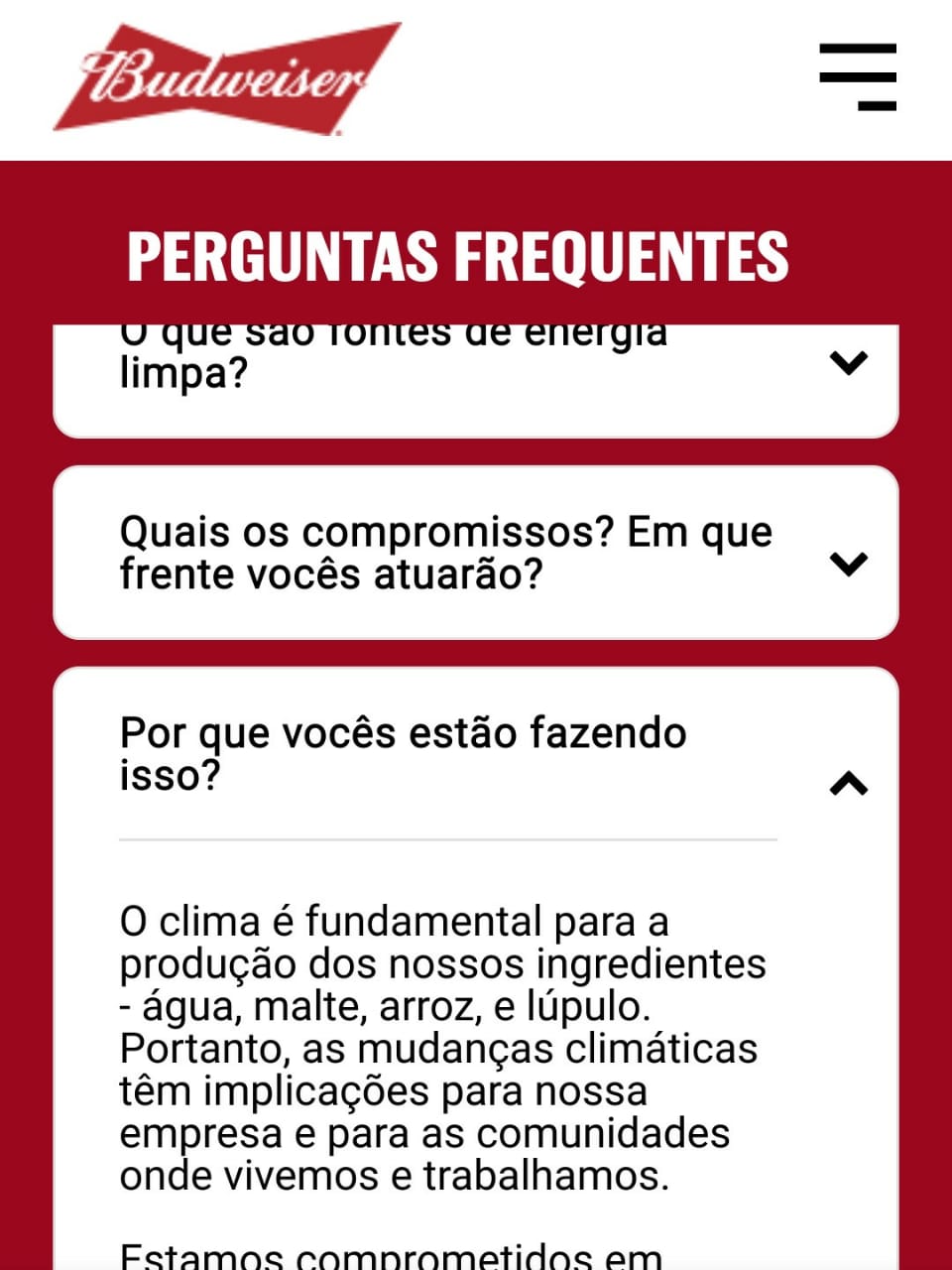
Arrange large chunks of information without bloating your page with an Accordion Container. With this component you can hide text under a title and it will only be shown when the user interacts with the component. It is often used for FAQs.
To use an Accordion Container you will need to add Accordion Items into it, which are also components.
Edited 4 years 4 months ago
Desktop

Mobile

Purpose:
Create an Accordion block:

Step by step:
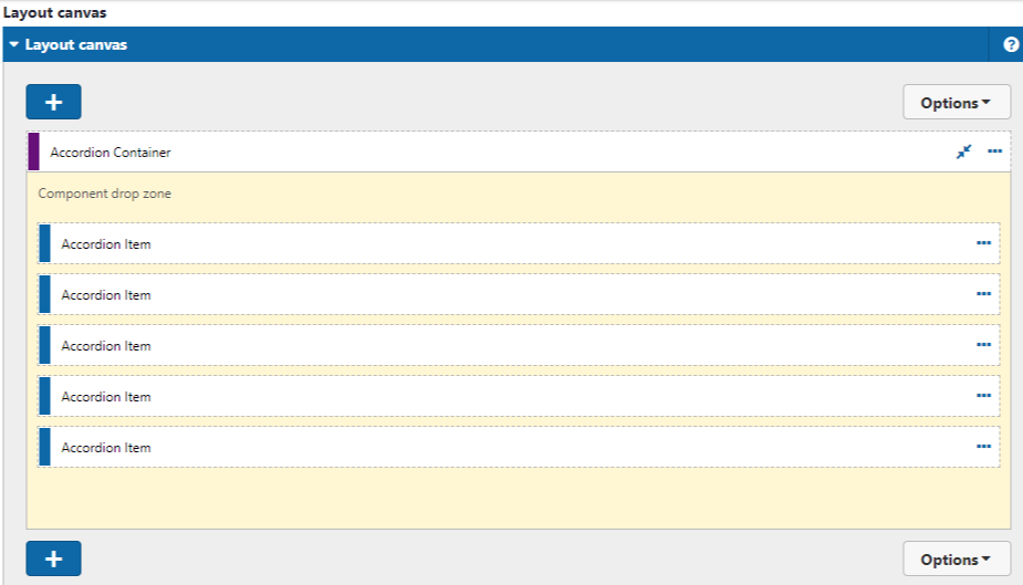
Component structure in Layout Canvas:
1. On the page you want to add the banner to, click the + on the Layout Canvas;
2. Search the list for the Accordion Container component and add it by taking it and dragging it to the Layout Canvas;
3. Insert the Accordion Item component inside the Accordion Container, and you can add it to the items inside the container. This means that your list will have multiple items.

Component customization:
1. Double-click on the Accordion Container you want to edit;
2. Edit the following fields:
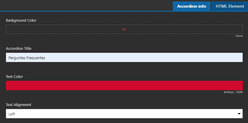
TAB: Accordion Info

- • Background Color
- • Add the background color of the block, being able to choose the colors of the brand palette.
- • Accordion Title
- • Enter the title of the block.
- • Text Color
- • Title color.
- • Text Alignment
- • Title alignment.
- • Left;
- • Center;
- • Right:
-
TAB: HTML Element

- • Title alignment.
- • HTML Element ID
- • Inform the HTML ID.
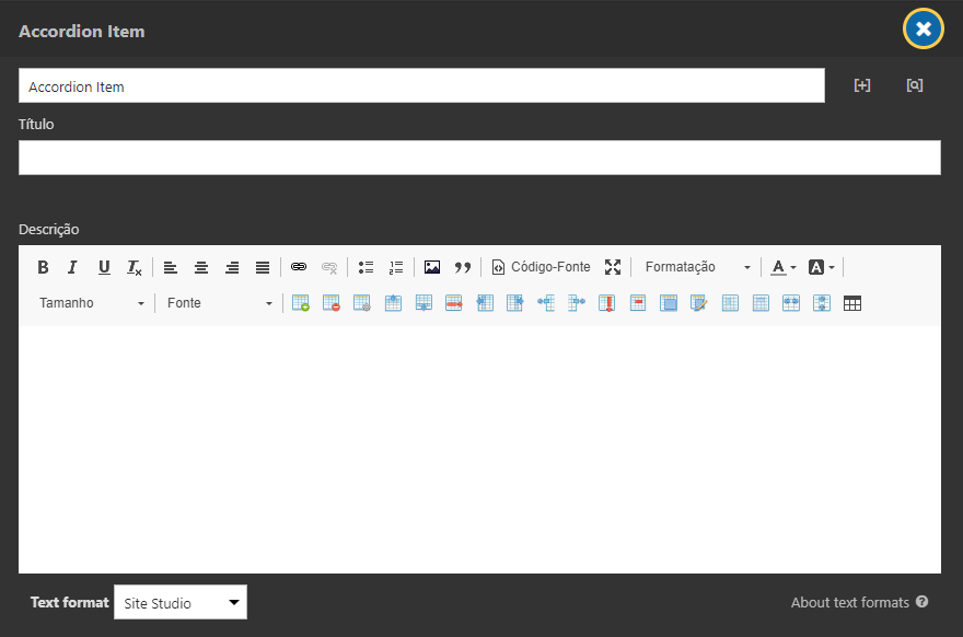
3. Double-click on the Accordion Item you want to edit;
4. Edit the following fields:

-
- • Title
- • Enter the title of the item. In that case, it is the text you will display above.
-
- • Description
- • Enter the description of the item. In this case, it is the text that will be presented within the accordion, it will only be possible to read when opening the item.
Scroll bar color are inserted in the style guide -> Scrollbar

- Background Color Scroll
- Select the background color of the scroll.
- Scroll Button Color
- Select the color of the scroll bar.


