Componentes
External Product Card
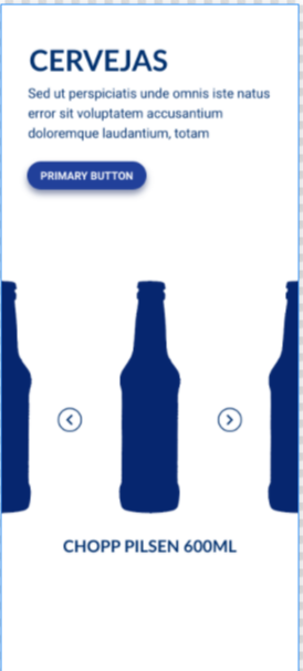
The carousel for products that are not registered on the site. In that case, the button would link to an external link.
Application example: Products that are sent directly to online stores.
Edited 3 years 8 months ago
Desktop

Mobile

Step by Step
Layout Canvas Structure:
1. On the page you want to add the banner too, click the + on the Layout Canvas;
2. Search the list for the component "Title and CTA Container" and add it by taking the component and dragging it to the Layout Canvas;
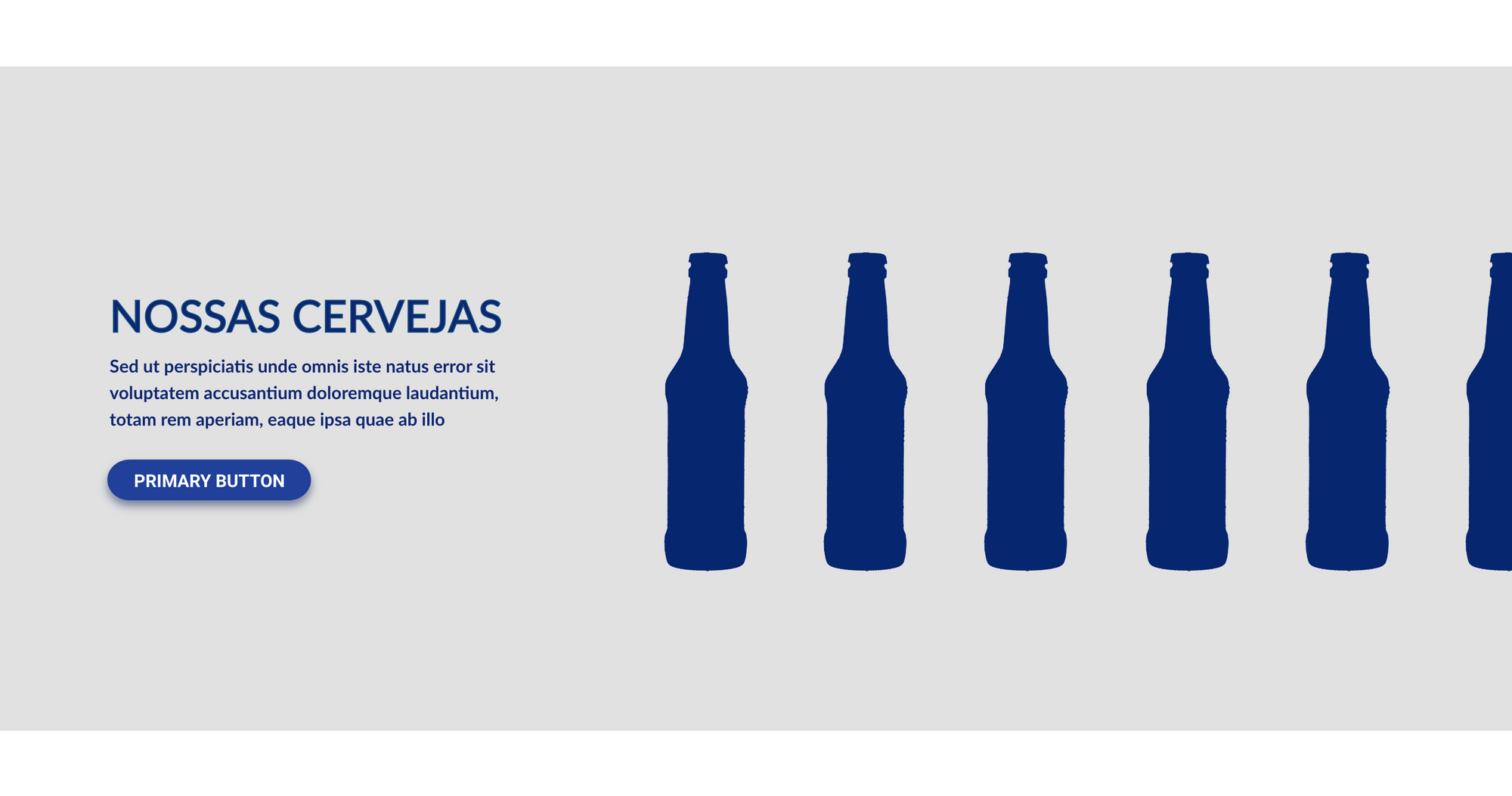
3. This component has the functionality to make the "call" of the carousel. In the illustrative image above, it is "Nossas Cervejas" with a description and redirect button;
4. Inside it place the "Slider Container", and inside the "Slider Container", insert the "External Product Card", which can be n (variable by the number of items you want inside the carousel).
** Note: If you do not want any text and only the product slider occupying the entire page, skip this step and proceed only from step 3.
Customizing the Component:
1. To configure the Title and CTA and Slider container, check the specific instructions by clicking here.
2. To customize the External Product Card, click twice on this component and set your prefers.
Product:
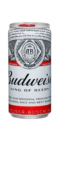
• Product Image: Upload the product image.
• Product Description: Inform the name of the product.
• Color Description: Select the font color of the text above, that is, the name of the product.
Button:
• Button Title: Inform the button text.
• Button Type: select an option of button type.
• Product Link: Add the link (URL must start at http://) of the product.
Where to Buy:
• Where to buy type: here select the option "Add Integration code", and after, inform the Integration Code provided by 2Buy Integration.
-
-
3. Click on "Apply" to save it.
To choose the type, color, and font of the button in your card, go to Components > Buttons > Applications > Click to inspect the image of Mouse Interactions


