

Components
Button
Buttons are the main way of interaction between user and system. You can choose between Primary/Secondary/Tertiary versions of the button, as well as customize its content, colors and shadows.
Edited 3 years 6 months ago
Desktop
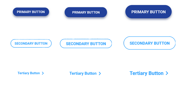
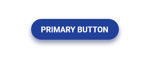
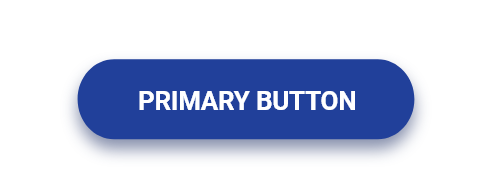
Primary Button
 Primary button small
Color text: $color_neutral_lightest Backgroud Color: $color_primary_medium
Typography $font_family_2 $font_weight_bold $font_size_xxs $font_line_height_short $font_spacing_defaut
Radios: $border_radios_pill
Shadow: $shadow_near $opacity_light $color_primary_medium
Spacing: $spacing_squish_md
Min width: 8.75rem ou 140px
Cursor: Pointer |
 Primary button medium
Color text: $color_neutral_lightest Backgroud Color: $color_primary_medium
Typography $font_family_2 $font_weight_bold $font_size_xxs $font_line_height_short $font_spacing_defaut
Radios: $border_radios_none
Shadow: $shadow_near $opacity_light $color_primary_medium
Spacing: $spacing_squish_sm
Min width: 8.75rem ou 140px
Cursor: Pointer |
 Primary button large
Color text: $color_neutral_lightest Backgroud Color: $color_primary_medium
Typography $font_family_2 $font_weight_bold $font_size_xxxs $font_line_height_short $font_spacing_defaut
Radios: $border_radios_pill
Shadow: $shadow_near $opacity_light $color_primary_medium
Spacing: $spacing_squish_xs
Min width: 5rem ou 80px
Cursor: Pointer
|
 Secondary button small
Color text: $color_primary_medium
Backgroud Color: none
Outline: $color_primary_medium $outline_border_thin
Typography: $font_family_2 $font_weight_bold $font_size_xxs $font_line_height_short $font_spacing_defaut
Radios: $border_radios_none
Spacing: $spacing_squish_sm
Min width: 8.75rem ou 140px
Cursor: Pointer |
 Secondary button medium
Color text: $color_primary_medium
Background Color: none
Outline: $color_primary_medium $outline_border_thin
Typography: $font_family_2 $font_weight_bold $font_size_xxxs $font_line_height_short $font_spacing_defaut
Radios: $border_radios_none
Spacing: $spacing_squish_xs
Min width: 5rem ou 80px
Cursor: Pointer |
 Secondary button large
Color text: $color_primary_medium
Backgroud Color: none
Outline: $color_primary_medium $outline_border_thin
Typography: $font_family_2 $font_weight_bold $font_size_xxs $font_line_height_short $font_spacing_defaut
Radios: $border_radios_none
Spacing: $spacing_squish_md
Min width: 8.75rem ou 140px
Cursor: Pointer |
Tertiary Button
 Tertiary button small
Color text: $color_primary_medium
Typography: $font_family_2 $font_weight_bold $font_size_xxxs $font_line_height_short $font_spacing_defaut
Text-decoration: underline;
Min width: 5rem ou 80px
Icon: -arrow right
Cursor: Pointer |
 Tertiary button medium
Color text: $color_primary_medium
Typography: $font_family_2 $font_weight_bold $font_size_xxs $font_line_height_short $font_spacing_defaut
Text-decoration: underline;
Min width: 8.75rem ou 140px
Icon: -arrow right
Cursor: Pointer |
 Tertiary button large
Color text: $color_primary_medium
Typography: $font_family_2 $font_weight_bold $font_size_xxs $font_line_height_short $font_spacing_defaut
Text-decoration: underline;
Min width: 8.75rem ou 140px
Icon: -arrow right
Cursor: Pointer |
Mobile
Step by Step
1. On the page that you want to add a button and click the “+” on the Layout Canvas;
2. Search for the component "Button" and add it by taking the component and dragging it to the Layout Canvas;
3. To position properly the Button, you can put it inside a component of container type.

Customizing the Component:
1. Click twice on the component, and select your options:
- • Button:
- ◦ Button label: write a label for the button.
- ◦ Button type: choose a type for the button in the list.
- ◦ Button align: select an aligned position for the button

• Button Link:
◦ Link to page: paste a link or search by writing the name. Empty not show the button.
◦ Button target: choose where your page will open.
- New window: When selecting this option, the link will open in a new browser tab. This option is recommended for external links (other sites).
- Same window: When selecting this option, the link will open in the same tab as the user's browser. This option is recommended for external links (site links);

-
-
• Button - Download:
- ◦ Entity: After adding the document you want the user to download, write the name of this document in "Entity" and when identifying it in the list, select it. To know how to add Media, click here.
** Note: if you have filled the Button link fields, don’t fill the Button - Download fields.

• Spacing:
- ◦ Paragraph Container Horizontal spacing: this setting will define the horizontal position. For example, if you choose “None”, the button will be positioned on the center.
- ◦ Paragraph content align: define the button alignment.
- ◦ Paragraph top spacing: define the spacing between the button and the top of the component.
- ◦ Paragraph bottom spacing: define the spacing between the button and the bottom of the component.

• Style:
- ◦ Input Background Color: select a color option for the button background
- ◦ Input Text Color: select a color option for the text of the button.

• HTML Element ID: An identifier that must be unique throughout the site. Your goal is to identify the element when navigating anchors. Anchoring allows the current element to be accessed through links and/or buttons, as long as they belong to the same domain (site).
2. Click on the “Apply”, to save your changes.
Light
• Default behavior
• Background color
• Font color
• Box shadow color
• Hover behavior
• Background color
• Font color
• Box shadow color
• Pressed behavior
• Background color
• Font color
• Box shadow color
• Disabled behavior
• Background color
• Font color
• Box shadow color
Dark
• Default behavior
• Background color
• Font color
• Box shadow color
• Hover behavior
• Background color
• Font color
• Box shadow color
• Pressed behavior
• Background color
• Font color
• Box shadow color
• Disabled behavior
• Background color
• Font color
• Box shadow color
Border radius
• Border radius type
