

Components
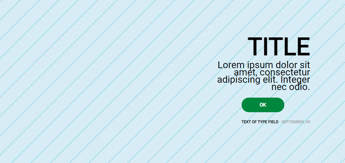
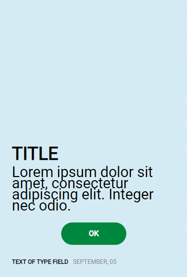
Banner Image - Type 3
The Banner Image component can be used to highlight contents and campaigns generally on the top of the pages.
Edited 3 years 8 months ago
Desktop
Mobile
Step by Step
1. At the page where you wish to add the Banner Image - Type 3 component, click the "+" button on the Layout Canvas;
2. Search the Banner Image - Type 3 component on the list, it is located in the "Content Components" category;
3. Drag and drop the component inside the canvas, and make sure to put it exactly where you wish to place it.

Customizing the Component:
1. To configure it, click twice on the component and fill the fields:
• HTML Element ID: An identifier that must be unique throughout the site. Your goal is to identify the element when navigating anchors.

• Image Shadow: select "ON" if you want a shadow over the image.

• Desktop/Mobile: select an image file for the desktop and mobile format. Pay attention to the image resolution required.

• Image Properties: inform an image title and image Alt and select an image height on the list.
◦ Image title: inform a name for the image, it’s important for SEO.
◦ Image Alt: inform a description for the image, it’s important for accessibility resources
Call To Action (Text block) optional
• Desktop/Mobile Block alignment: Select the position of the text block inside the container.

• Title: to format the title, select the Heading, Font style option, inform the title and choose a Font size and color option.

• Description: it's the text that will display below the title. To format this, select the Font style option, write the description text and choose a Font size and color option.

• Type and Date: inform the type name and date.

Button: to activate the button, select "ON" and fill the fields:
• Button Action: select if you want a button for redirect link, download content, or Where to Buy.

• Button Properties: to Link or Download button, inform:
◦ Text: Inform a label for the button
◦ Title: type a description for the button.
◦ Type: select a button type option on the list.
◦ Color: sets the color of the text and border of the button
◦ Alignment: choose an alignment option.

• Button- Link: if it's a button link, inform the URL of the page and select a Target option.

• Button - Download: to add content for download, check the instructions here, and after search the content by the name.

• Button - Where to Buy: here select the option "Add Integration code", and after informing the Integration Code provided by 2Buy Integration.

2. Click on "Apply" to save it.
