Components
7 Card Frame
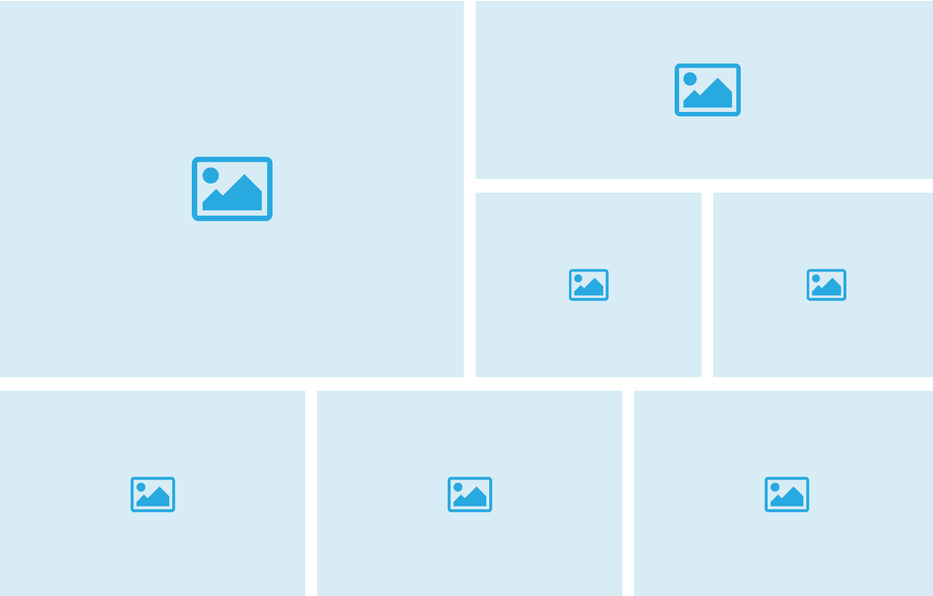
This component displays 7 Images in a fixed grid with differently sized boxes. You can also use the cards to redirect the users to different pages, both by opening the page on the current tab or in a new one.
Edited 3 years 3 months ago
Desktop

Mobile

Step by Step
1. At the page that you wish to add the 7 card frame component, click the "+" button on the Layout Canvas;
2. Search the 7 card frame component on the list, it is located in the "General Components" category;
3. Drag and drop the component inside the canvas, and make sure to put it exactly where you wish to place it.
Customizing the Component:
1. Click twice on the component to set the configurations:
Image:
• Image Card desktop/mobile: select an image file for desktop and mobile format.
• Image Alt: inform a description for the image, it’s important for accessibility resources.
• Image title: inform a name for the image, it’s important for SEO.
Link:
• Link: paste a link or search the page you want by writing the name.
• Link title: write a label for the link.
• Open in new tab: select ON if you want the link opens on another page, if not, leave the toggle OFF.
• Text: write the text that will appear above the image. It is possible to format the text (Change font, color, size, alignment)
2. Click on the other tabs, and fill the fields according to the instructions above to customize the other cards.
3. To finish it click on "Apply".


