

Components
Slider with depoiments
Use this component to have a slider with depoiments/testimonials in your site, this could be very useful for when you want to show what the people are saying about your product.
Edited 3 years ago
Desktop

Mobile

Step by step:
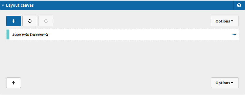
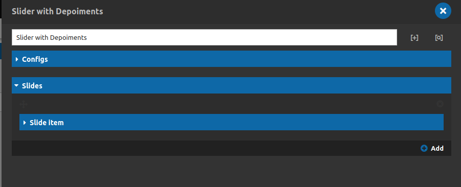
1. First, you need to add an Slider with depoiments. To do that, go to the page that you want to add this component, and click the “+” on the Layout Canvas;
2. Search in the list for the Slider with depoiments and add it by dragging the component into the Layout Canvas;
3. After that you can configure the component - it is important to notice that you have 2 areas build this slider, lets start by the settings of the slider itself, and then the settings of each slide:
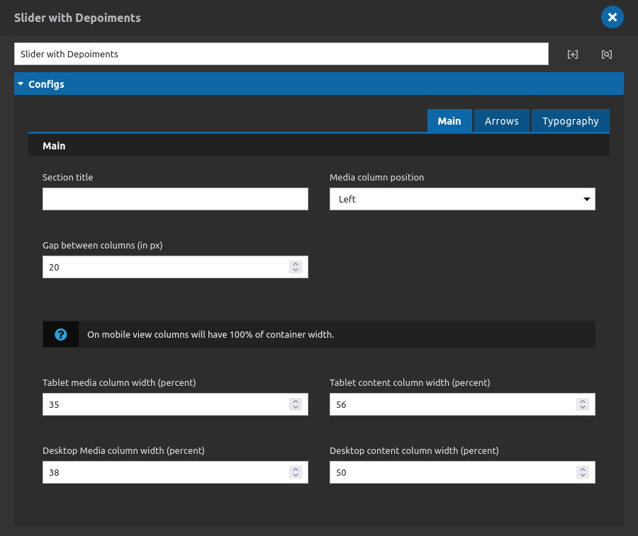
Main Tab
Main:
- • Section title: a title for the slider.
- • Media column position: Select the position of the image column (left, right).
- • Gap between columns (in px): the space in pixels between the column of the image and the column of the content.
- • Tablet Media columns width (percent): width in percent of the image column (tablet breakpoint).
- • Tablet Media content width (percent): width in percent of the content column (tablet breakpoint).
- • Desktop Media columns width (percent): width in percent of the image column (desktop breakpoint).
- • Desktop Media content width (percent): width in percent of the content column (desktop breakpoint).
-
-
-
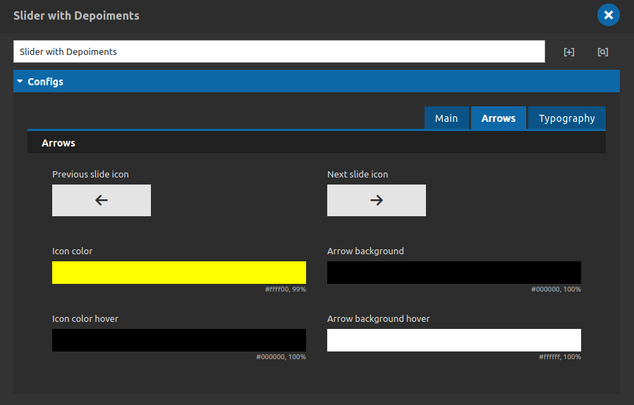
Arrows Tab
-
-
-
Arrows:
- • Previous slide icon: select the icon for the previous arrow.
- • Next slide icon: select the icon for the next arrow.
- • Icon color: choose a color for the icon itlsef.
- • Arrow Background: choose a color for the backgrounds of the icons.
- • Icon color Hover: chose the color of the icon itself when the mouse is over it.
- • Arrow Background Hover: choose a color for the backgrounds of the icons when the mouse is over it.
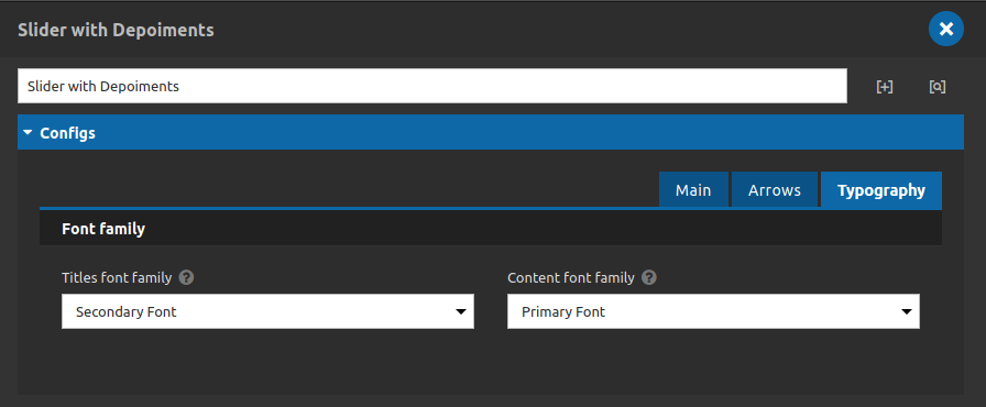
Typography Tab
-
Font Family:
- • Title font family: select the font family for your slider title.
- • Content font family: select the font family for your slide numbers and for the slide link.
- Note: the font family options reflect the style guide - Typography of Da Vinci websites.
4. Now, we are going to add the content for all slide items that we need, lets take a look:
Pay attention to the "add" button in the bottom, to add a new slide item click on it.
For each slider item we have the options below:
Tabs content, link and typography.
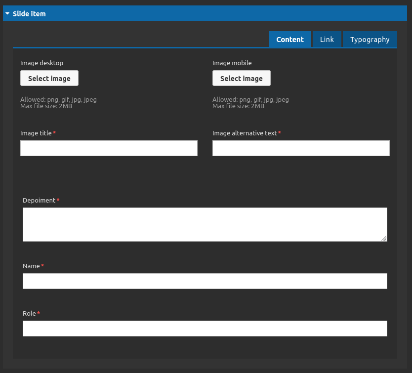
Slider item - Content Tab
- • Image Desktop: select the image for your slide item (desktop).
- • Image mobile: select the image for your slide item (mobile).
- • Image title: set the image title.
- • Image alternative text: set the alt text for your image.
- • Depoiment: type a description as a depoiment for your slider item.
- • Name: type the name of the person who is providing the depoiment.
- • Role: type the role of the person who is providing the depoiment.
Slider item - Link Tab
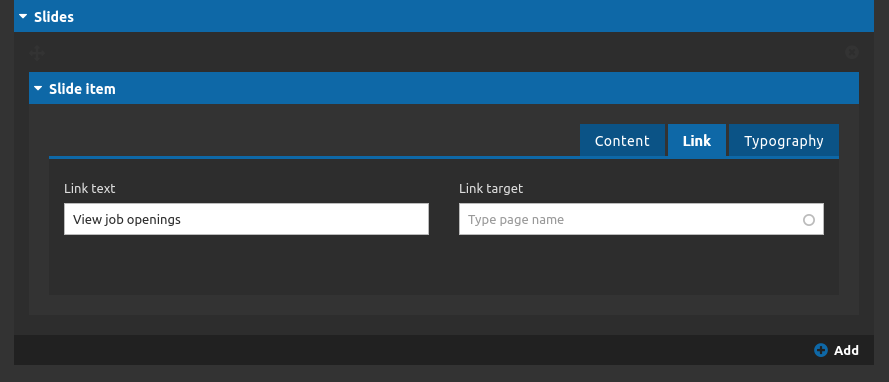
- • Link Text: type the link label of the slider item.
- • Link Target: choose the link target of the slider item (if it should be open in a new tab or not).
Slider item - Typography Tab
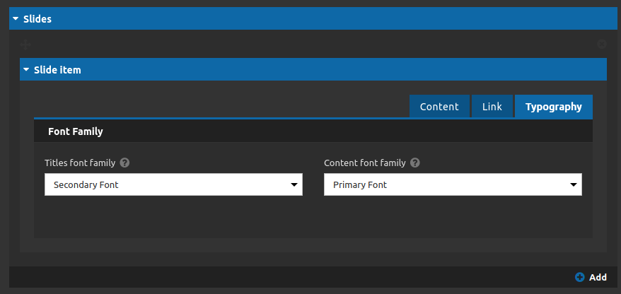
Font family:
- • Titles font family: select the font family for your slider item title.
- • Content font family: select the font family for the rest of the content.
5. After you have finished all your list items click on "apply" button.
