

Components
Info Card
This component gives you a better control of card elements with options like addition of extra texts, icons and colors.
Edited 3 years ago
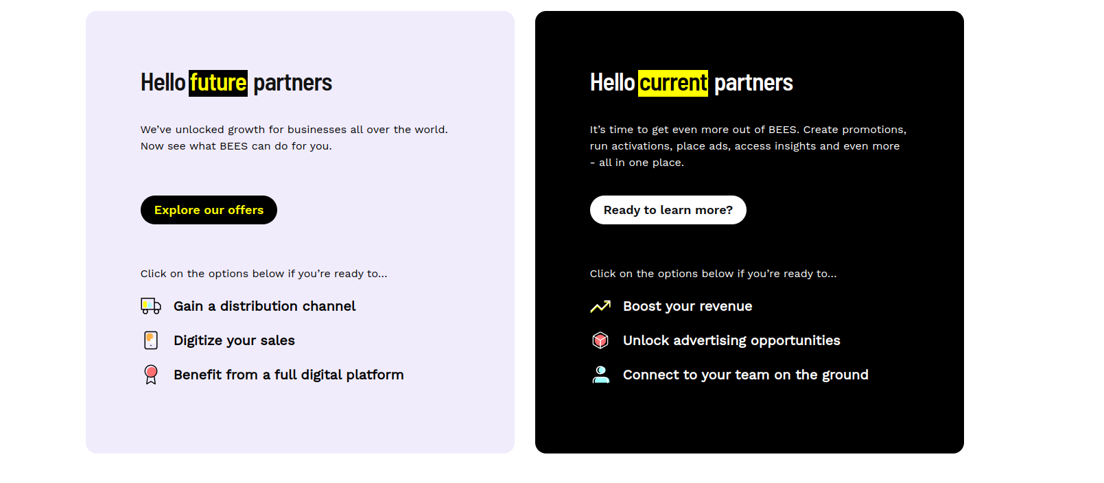
Desktop
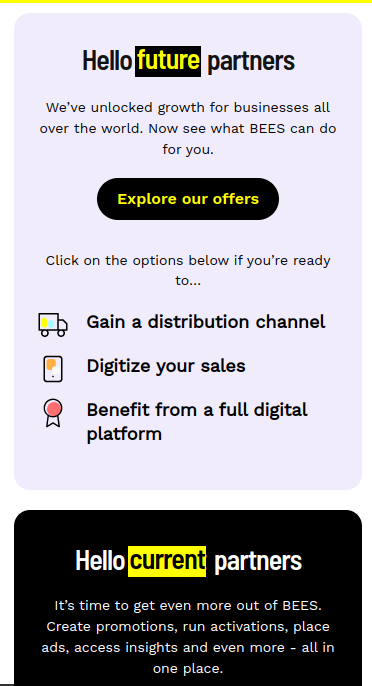
Mobile
Step by step:
1. First, you need to add an Info Card. To do that, go to the page that you want to add this component, and click the “+” on the Layout Canvas;
2. Search in the list for the Info Card and add it by dragging the component into the Layout Canvas;
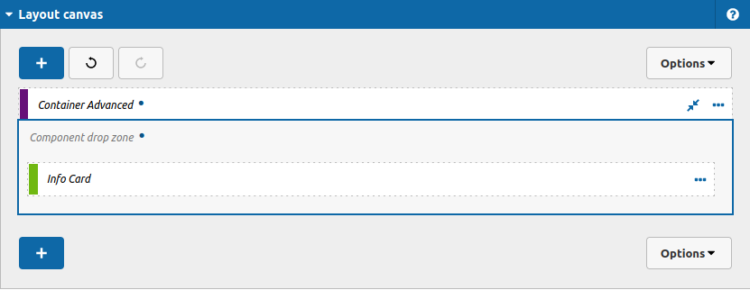
3. After that you can define your settings for this component, take a look:
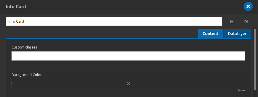
Content Tab
- • Custom classes: Add any new custom class that you need for your component here, separate classes by whitespace.
- • Background Color: Set background color for your card.
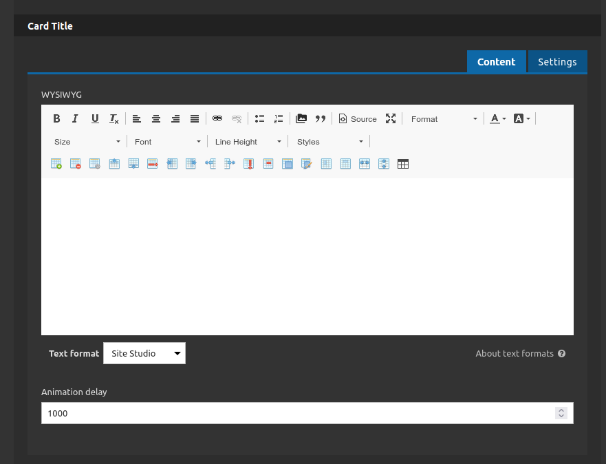
Card Title:
Content Tab
- • Wysiwyg: Type your title here.
- Note: This wysiwyg works with the Text Animation Highlight component, so you can add a animation text on it.
- Check more details here, about how to apply this effect.
- • Animation Delay: Set the delay to start the animation.
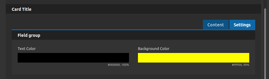
Settings Tab
- • Text Color: If you choose to use the Text Animation Highlight you can set the text color here.
- • Background Color: If you choose to use the Text Animation Highlight you can set the background color here.
- Scrolling down...
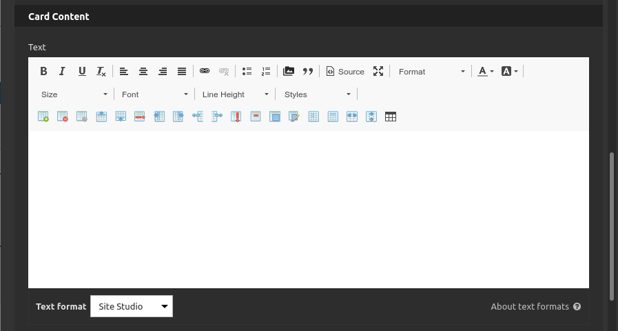
Card Content:
• Text: Type the card text below the title here.
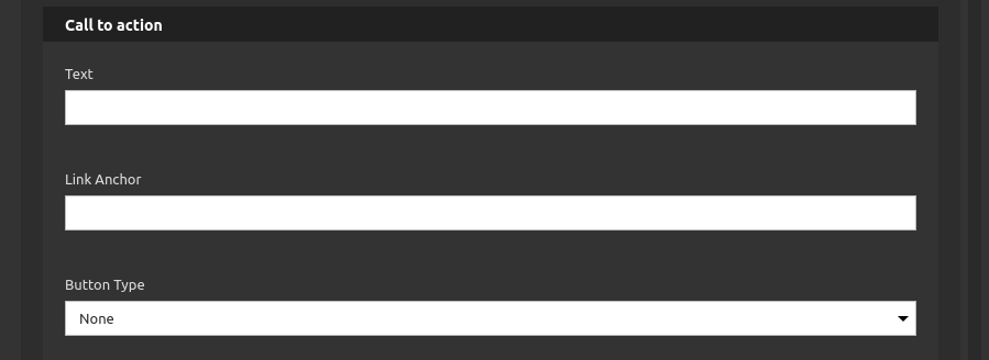
Call to Action:
• Text: Type the link label here.
• Link Anchor: Type anchor link for some id placed inside this page (without the #), here.
• Button Type: Select a custom style for the button/link.
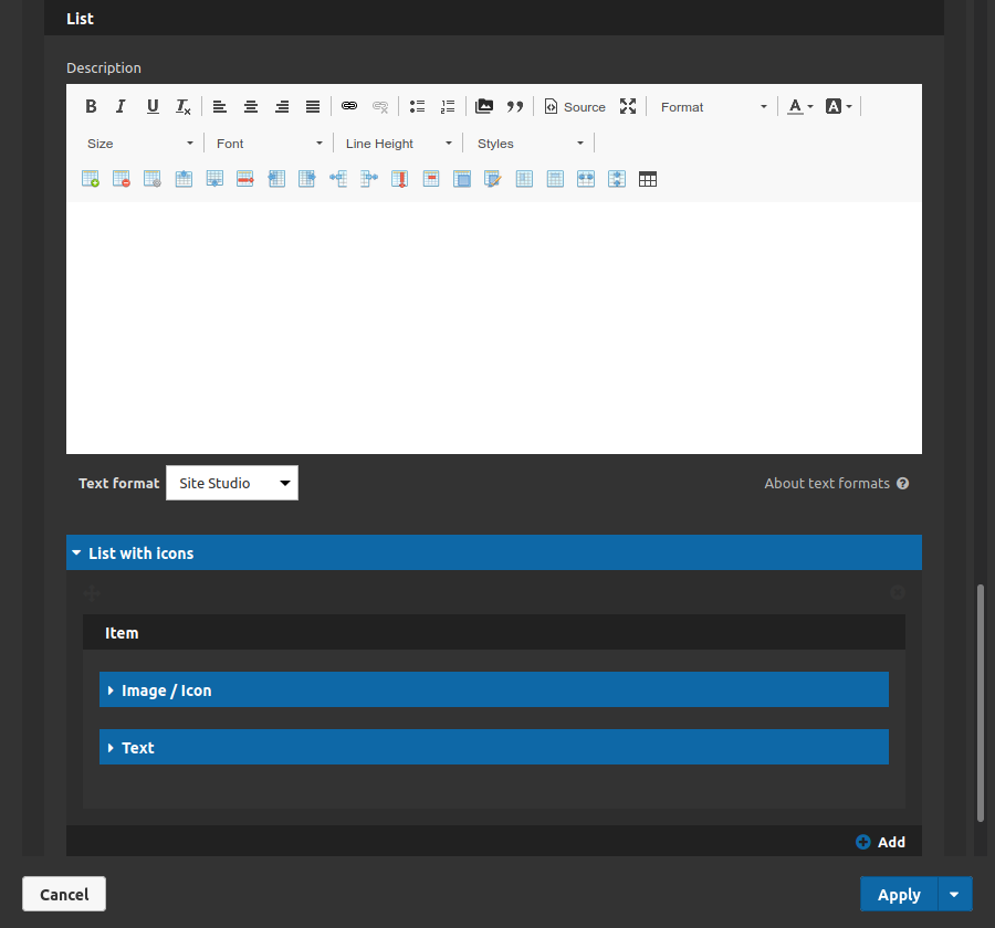
List:
• Description: Type a message or a description for the list incoming.
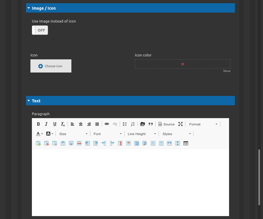
List with icons - item - Image / Icon Tab:
• Use image instead of icon: Toggle to choose if you want a icon or a image.
Note: if you select Icon:
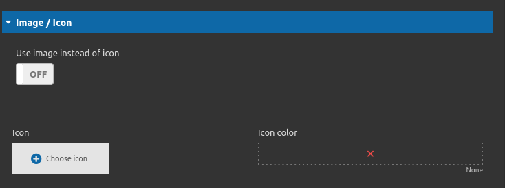
• Icon: Select the icon here.
• Icon color: Set a icon color here.
Note: if you select Image:
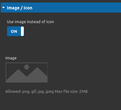
• Icon color: Upload the image that you want here.
List with icons - item - Text:
• Paragraph: Type the content of your list item here.
• Add: Use this button to add more items to the list, if you want.
In addition to all these settings you can also define the datalayer of this component at "Datalayer Tab".
4. After that click on "apply" button and save the page to see the component working.
