

Components
Content Card Advanced
Like the Content Card, it serves as an information card with the possibility of adding a redirect button. The difference is that the Content Card Advanced has more options to customize the card, such as border radius, margin, and padding.
This component can be used inside the Slider container advanced or other containers.
Edited 3 years 5 months ago
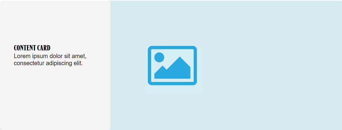
Desktop
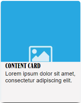
Mobile
Step by Step:
1. On the page you want to add the banner, click on the “+” of the Layout Canvas;
2. If you want the Content Card in a loop, search for the Slider Container to create the carousel and add it by grabbing the component and dragging it to the Layout Canvas;
** Note: If you don’t want a carousel, you can choose any other container type.
3. And inside the "Slider Container", insert the "Content Card Advanced", which can be n (variable by the number of items you want inside the carousel).

Customizing the Component:
1. Click twice on the component, set your prefers:
- • Background:
-
- ◦ Background Image: upload an image for desktop and mobile format
- ◦ Background type: choose if you want to use an SVG Image, Background color, or leave it blank, that is, you won't have a square with a background for the card's texts.
- ◦ SVG image: There are tags that have a mask with different designs to add as a background for the text. Select this option if your brand has and if you want;
- ◦ Background Color: Possibility of adding a background color to the text, as shown in the component illustration;

◦ Gradient: select “on” if you want a gradient color on your card. Choose a color and select a boundary for the gradient

- • Text:
-
- ◦ Card Title: write a title for the card;
- ◦ Title color: select a color for the title;
- ◦ Font family: select a type of font for the title;
- ◦ Heading element: choose an option of heading. To know how to choose a heading, click here.

◦ Description: write a text description for the card. The text to be displayed in the description has a limitation of only two lines.

- • Card Configuration:
-
- ◦ Card size: select a size option for the card.
- ◦ Border radius: select a size if you want a border rounded.
- ◦ Card shadow: select “Card Shadow” if want a shadow on the card or “None”, if you won’t.

◦ Margin Top/Bottom and Left/Right: define the space between the border of the card and the border of the container component.

◦ Padding top/bottom and left/right: define the space between the elements inside the card (as text and title) and the border of the card.

- • Button:
-
- ◦ Button: select “On” to activate the button. A link can only be added using the button.
- ◦ Title: inform a title for the button. This title is like a label for the button.
- ◦ Type: select a type for the button on the list.
- ◦ Alignment: select a position for the button

- ◦ Link to Page: if you want to use a link to redirect, paste the URL for external pages, or for internal pages, type “/” and search for the page that you want.
- ◦ Button - Download:
- ◦ Entity: After adding the document you want the user to download, write the name of this document in "Entity" and when identifying it in the list, select it. To know how to add a media, click here.

2. Click on the “Apply” button to save your modifications.
