

Components
Content Card
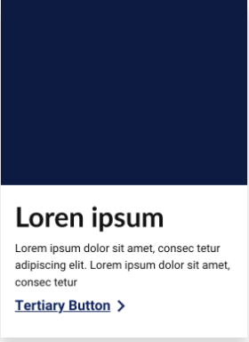
This component serves as an information card with the possibility of adding a redirect button. A link can only be added using the button, so clicking on the image does nothing.
This component can be used inside the container slider and slider container advanced.
Edited 3 years 5 months ago
Desktop
Mobile

Component Structure in Canvas Layout:
1. On the page you want to add the banner, click on the *+* of the Layout Canvas;
2. Look in the list for the component "Slider Container" to create the carousel and add it by grabbing the component and dragging it to the Layout Canvas;
- It doesn't matter if you want to add only one image card or n image cards, you need to add the container above.*
3. And inside the "Slider Container", insert the "Content Card", which can be n (variable by the number of items you want inside the carousel).

NOTE: If you want a carousel with callout text on the side, view the "Title and CTA Container" manual.
Component customization:
ABA: Card Content

- Title:
- Inform the title of the card.
- Description:
- Inform the description of the card.
- Card Size:
- *Small:* Select if the desired card layout is small.
- *Medium:* Select if the desired card layout is medium;
- *Large:* Select if the desired card layout is the big one.
- Image:
- Add card image to Desktop devices.
- Image Mobile
- Add card image to Mobile devices.
- Background Type - Desktop:
- SVG Image: There are tags that have a mask with different designs to add as a background for the text. Select this option if your brand has and if you want;
- Background Color: Possibility of adding a background color to the text, as shown in the component illustration;
- Leave it blank if you don't want any of the above options, that is, you won't have a square with a background for the card's texts.
- Background Type - Mobile:
- SVG Image: There are tags that have a mask with different designs to add as a background for the text. Select this option if your brand has and if you want;
- Background Color: Possibility of adding a background color to the text, as shown in the component illustration;
- Leave it blank if you don't want any of the above options, that is, you won't have a square with a background for the card's texts.
- Background Color - Desktop
- If you select "Background Color" in "Background Type", it will be in this area that it will be necessary to inform the background color of the text.
- Background Color - Mobile:
- If you select "Background Color" in "Background Type", it will be in this area that it will be necessary to inform the background color of the text.
ABA: Button

- Button:
- On: If you want a button at the end of the text, turn on the option;
- Off: If not, keep it off.
- Button Title:
- Add the text that will display on the button.
- Button Type:
- Selection of the button layout, which can be:
- Primer (With variations in color and size);
- Secondary (With variations in color and size);
- Tertiary (With variations in color and size).
- The layout of the buttons is in Buttons page > Applications; There are sizes (Small, Medium and Large) in addition to color variations.
- Example below you can see that the "Dark" button colors are those that are positioned on a dark background.

Next, we can choose to have the button redirect to a link OR the user can directly download a file (which needs to be uploaded to "Media" in advance).

- Button - Link:
- Link to Page:
- External Link: To add an external link (Outside the site), enter the URL (and don't forget that you need to have the `http://` beforehand);
- Internal Link: Add only the post / link from our site (Example: In `http://www.ambev.com.br/esse-link`, inform only the `/esse-link`)
- Button Target:
- Same Window: When clicking on the button, the informed URL will open in the same browser tab as the current page. It is recommended if the link is from the same site so that the user does not leave the site experience.
- New Window: When clicking on the button, the informed URL will open in the new browser tab that the current page is. It is recommended if the link is from another site.

- Button - Download:
- Entity:
- After adding the document you want the user to download, write the name of this document in "Entity" and when identifying it in the list, select it.
SVG images for overlay are inserted in the style guide -> Cards
To choose the type, color, and font of the button in your card, go to Components > Buttons > Applications > Click to inspect the image of Mouse Interactions.
