

Components
Internal Product Card
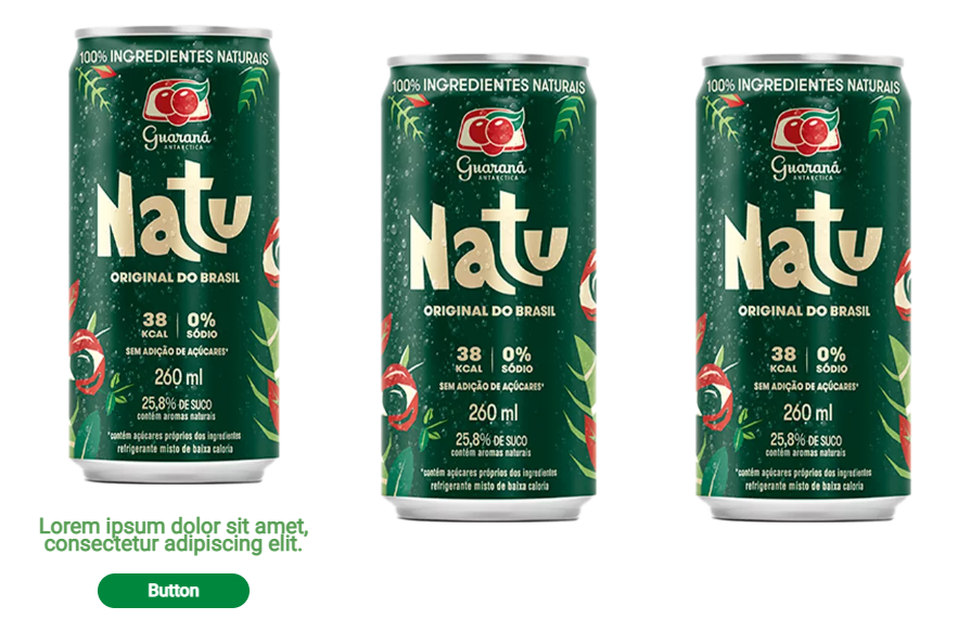
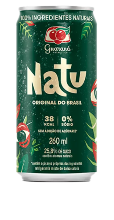
The carousel for products that are registered on the site. In that case, the button would link to an internal product page.
Edited 3 years 8 months ago
Desktop
Mobile
Step by Step
1. On the page you want to add the banner click the + on the Layout Canvas;
2. Search for the component "Text and CTA Container" and add it by taking the component and dragging it to the Layout Canvas;
**Note: If you do not want any text and only the product slider occupying the entire page, skip this step and proceed only from step 3.
3. Inside it place the "Slider Container" to create the carousel itself;
4. And inside the "Slider Container", insert the "Internal Product Card", which can be n (variable by the number of items you want inside the carousel).

5. To customize the component click twice:
Product:
• Product Image: Upload the product image.
• Product Description: inform the text that will show up on hover.

Button:
• Button Title: Inform the button text.
• Button Type: select a layout button option on the list, it can be Button 1 or Button 2, both with size variations Small, Medium, and Large.

• Product Link: in the field "Entity" search by the name of the page product that you want to redirect the user.

6. Click on "Apply" to save.
To choose the type, color, and font of the button in your card, go to Components > Buttons > Applications > Click to inspect the image of Mouse Interactions.

Product description.
Product description.
Product description.
Product description.
