

Components
Slider thumbs
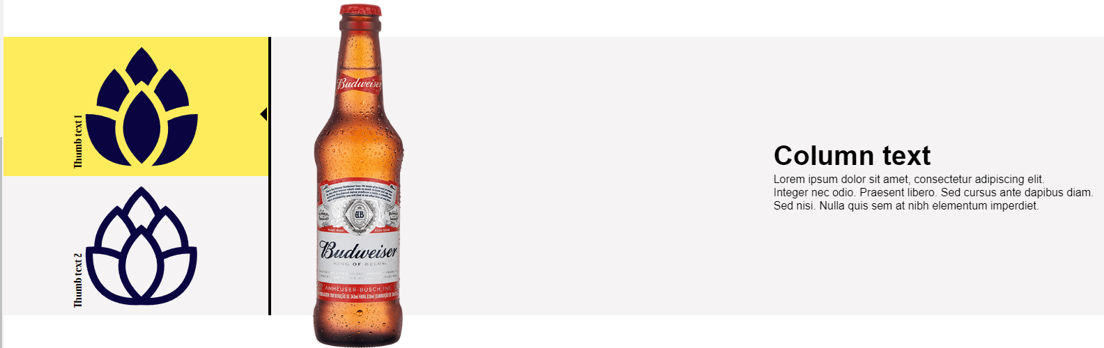
This component allows users to showcase their products with a detailed description, while showing a smaller preview of the next slides.
Edited 3 years 6 months ago
Desktop
Mobile
Step by Step
1. For this component to work properly, first you need to add two other components: Slider thumb item and Two column image and text (slider thumbs). To know how to configure them, check the specific instructions by clicking on their names.
2. On the page that you want to add these components, click the “+” on the Layout Canvas, search for the Slider thumbs, then drag and drop it into the Layout canvas.
3. After this, insert the Slider thumb item and Two column image and text on the Slider thumbs.

** Note: Each Slider thumb item is associated with an individual item of the slider, thus the items of each thumb must be entered in the same order as the thumbs.
4. To configure it, click twice on the Slider thumbs:
Thumb Content:
• Thumb text: write the title that will be displayed beside the thumbnail.
• Thumb image: select the image that will be used as a thumbnail.
• Thumb image Alt: inform a description for the image you just uploaded. This is important for accessibility resources.
• Thumb image title: inform a name for the image. This is important for SEO.
 **Note: you can add as many thumbnails as you want. Just click on the “+ Add” at the bottom.
Thumb Style:
• Thumb colors: select the default color for the text and background.
• Thumb active colors: select the color for the text and background for the currently active thumbnail.

5. Click on the “Apply” button to save your modifications.
