

Components
Text Card [bees.com]
This card component gives you an option to add a title, link and some text to see when the mouse is over the card.
Edited 3 years 1 month ago
Desktop

Mobile

Step by step:
1. First, you need to add an Text Card [bees.com]. To do that, go to the page that you want to add this component, and click the “+” on the Layout Canvas;
2. Search in the list for the Text Card [bees.com] and add it by dragging the component into the Layout Canvas;
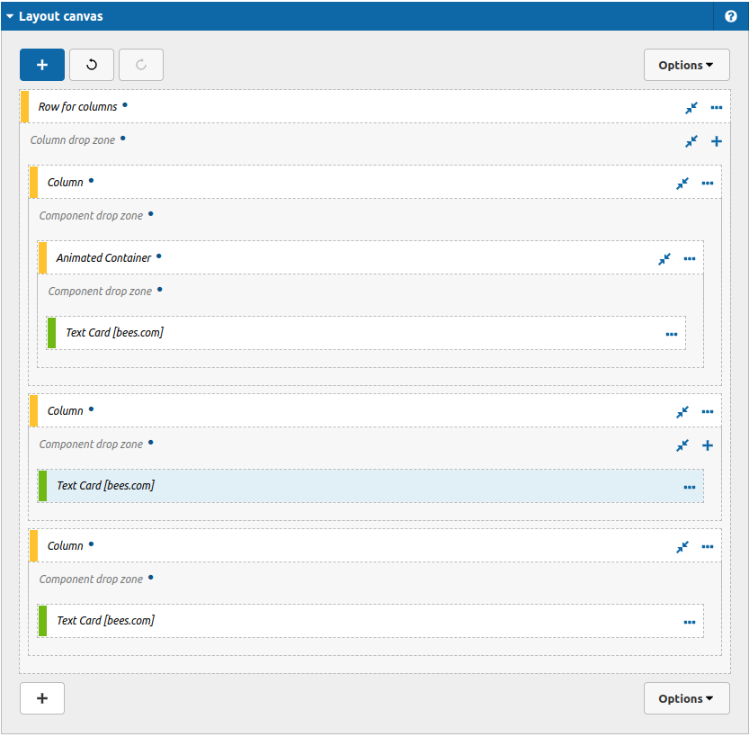
3. After that you can take a look on the options:
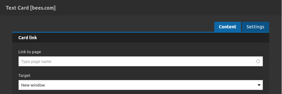
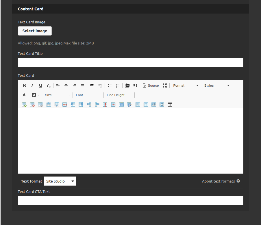
Content Tab
Card Link:
- • Link to Page: Type url to redirect the link
- • Target: Select if you want to open the link in a new tab or not.
Content Link:
- • Text Image Card: Select the image for this card.
- • Text Card Title: Type the title for this card.
- • Text Card: Type the description of this card (it will be visible when the mouse is over the component).
- • Text Card CTA Text: Call to action link label.
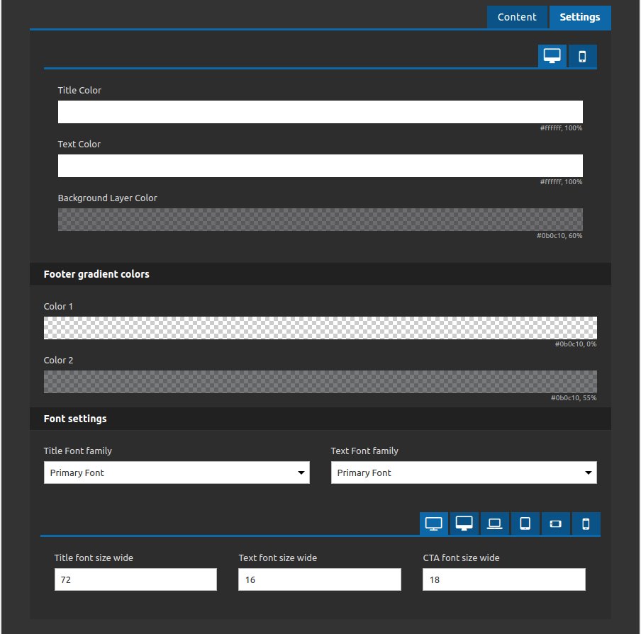
Settings Tab
- • Title color: Select the color of the title
- • Text Color: Select the color of the text card
- • Background layer Color: Select a background color to overlay the card
Footer Gradient Colors:
- • Color 1: Select the first color for the footer gradient.
- • Color 2: Select the second color for the footer gradient.
Font Settings:
- • Title Font Family: Set the font family for the title (select among the style guide options: primary, secondary, tertiary, quaternary, quintenary).
- • Text Font Family: Set the font family for the text (select among the style guide options: primary, secondary, tertiary, quaternary, quintenary).
- • Title font size (breakpoint): Set the font size for the title at each breakpoint allowed (wide and mobile).
- • Text font size (breakpoint): Set the font size for the text at each breakpoint allowed (wide and mobile).
- • CTA font size (breakpoint): Set the font size for the call to action link label at each breakpoint allowed (wide and mobile).
4. After that you click on "apply" button and repeat the same process for others cards if you need.
