

Components
Product Card
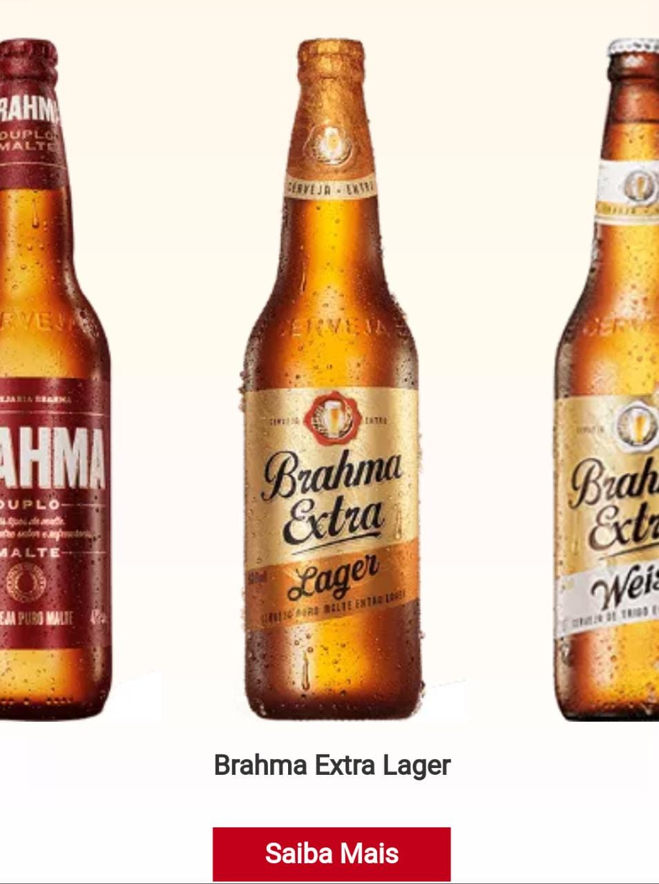
This component is a carousel for products that are not registered on the site. In that case, the button would link to an external link.
Can be used for products that are sent directly to online stores.
Edited 4 years ago
Desktop

Mobile
Step by Step
1. Firstly, to properly position the Product Card, in the Layout Canvas click on the “+” button, search for the Slider Container in the Components list, and drag it to the Layout.
2. Then, click on the “+” again, search for the Product Card in the Cards Components list, and drag it to the Slider Container drop zone.
3. You can add more Product cards, just repeat step 2, or duplicate an existing component.

Customizing the Component:
1. To configure it, click twice on the component and fill the fields:
• Product:
- ◦ Product image: select an image of the product.
- Image format: needs to be in png, gif, jpg, jpeg format.
- File size: the maximum file is 2MB
- Resolution: needs to be in 160 x 420 (width x height)
- ◦ Image Title: inform a name for the image. This is important for SEO.
- ◦ Image Alt: inform an image description. This is important for accessibility resources.
- ◦ Product description: text that shows up when the cursor is positioned on the image. It’s optional.
- ◦ Color description: Select the font color of the text above, that is, the name of the product.

• Button:
- ◦ Button Title: Inform the button text.
- ◦ Button Type: select a button size in the list. That can be Button 1 or Button 2, both with three size variations.
- ◦ Product Link: Add the link (URL must start at
http://) of the product. 
• Where to Buy:
◦ Where to buy type: here select the option "Add Integration code", and after inform the Integration Code provided by 2Buy Integration.

• HTML Element ID: An identifier that must be unique throughout the site. Your goal is to identify the element when navigating anchors. Anchoring allows the current element to be accessed through links and/or buttons, as long as they belong to the same domain (site).

2. Click on the “Apply” button to save your modifications.
