

Components
Modal
This component is a Modal that only shows its contents when the user clicks on a button. Use it to enhance the user's experience by adding information to your website without having to display all of it at once. This Modal is not locked, meaning you can click anywhere to dismiss the container.
Edited 3 years 6 months ago
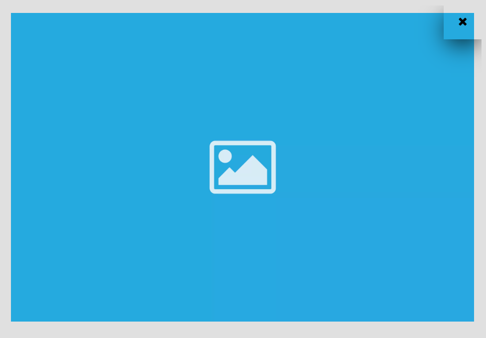
Desktop
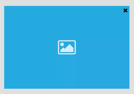
Mobile
Step by Step
1. At the page that you wish to add the Modal component, click the "+" button on the Layout Canvas;
2. Search the Modal component on the list, it is located in the "General Components" category;
3. Drag and drop the component inside the canvas, and make sure to put it exactly where you wish to place it.

Customizing the Component:
1. Click twice on the component, and select the options that you want:
Button Configuration:
• Open modal button: here you need to inform a label, aria-label and choose options for style, alignment, and margin.

Modal Configuration:
• Overlay configuration: overlay is the modal block that is above the site, separating the site content from the modal content. Choose a color for the close button and the background.
◦ Overlay transparent: Leave the toggle OFF if you want a solid color or select ON if you want a transparent color and define the opacity.

• Content configuration: choose a color for the content background and select the option of border radius, padding, and modal width.

2. Click on "Apply" to save it.
