

Components
Webdoor
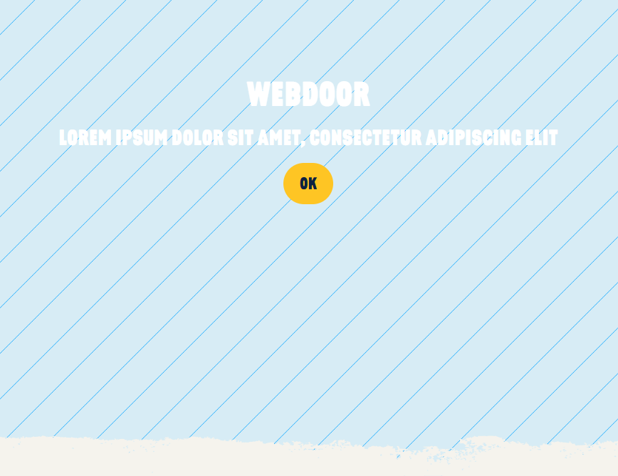
Desktop
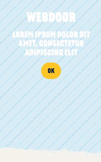
Mobile
Step by Step
1. At the page that you wish to add the Webdoor component, click the + button on the Layout Canvas;
2. Search the Webdoor component on the list, it is located in the "General Component" category;
3. Drag and drop the component inside the canvas, and make sure to put it exactly where you wish to place it.

Customizing the Component:
1. Click twice on the component, and select your options:
Content:
• Background: select an image file for the background

• Title: inform a title
• Title size: choose a size for the title
• Text: write a text description for the component
• Text size: choose a size for the text block

Style:
• Bottom Style: choose if you want the bottom with Scribble style or None.

Bottom Scribble
Button:
• Button label: write a text label

• Open Modal: select "On" if you want this button to open a Modal.
◦ Modal Settings: Choose the modal selector
◦ Modal Class: inform the modal Class (Modifier)
** Note: Modal settings and Modal class information are in the component that has a Modal. To check it, click twice on the Modal component.

• Button target: choose where your page will open. Write New window or Same window.
- ◦ Same window: When selecting this option, the link will open in the tab the user's currently at. This option is recommended for internal links (site links);
- ◦ New window: When selecting this option, the link will open in a new browser tab. This option is recommended for external links (other sites).
• Button URL: inform the redirect link

2. Click on the “Apply”, to save your changes.
