Components
Loading Page - Text and Image
With this component you can set a loading page status triggered by some events of browser.
Edited 2 years 4 months ago
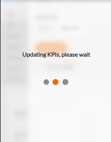
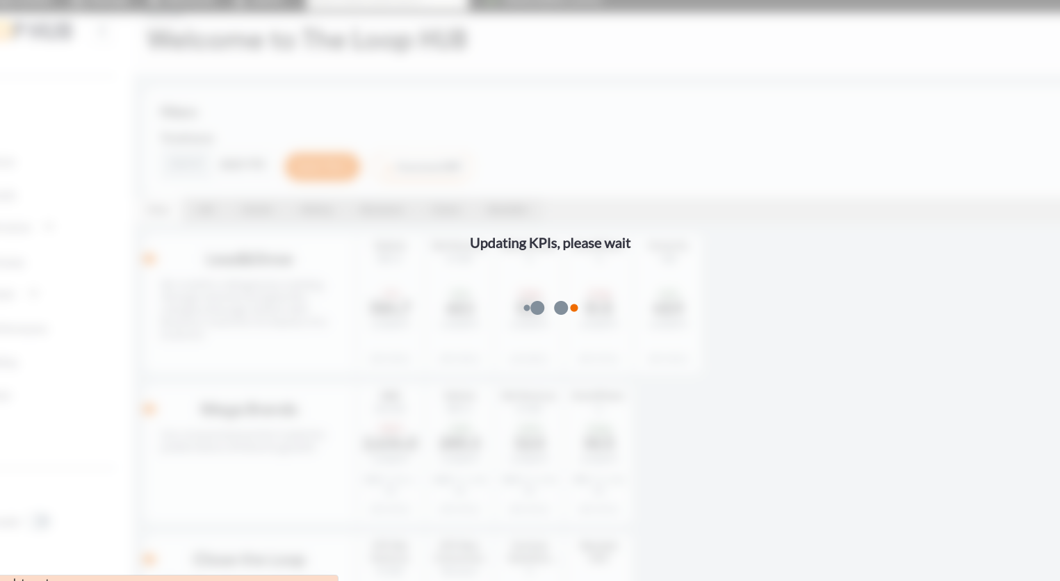
Desktop

Mobile
Purpose:
Propagate visual status through page navigation:
Step by step:
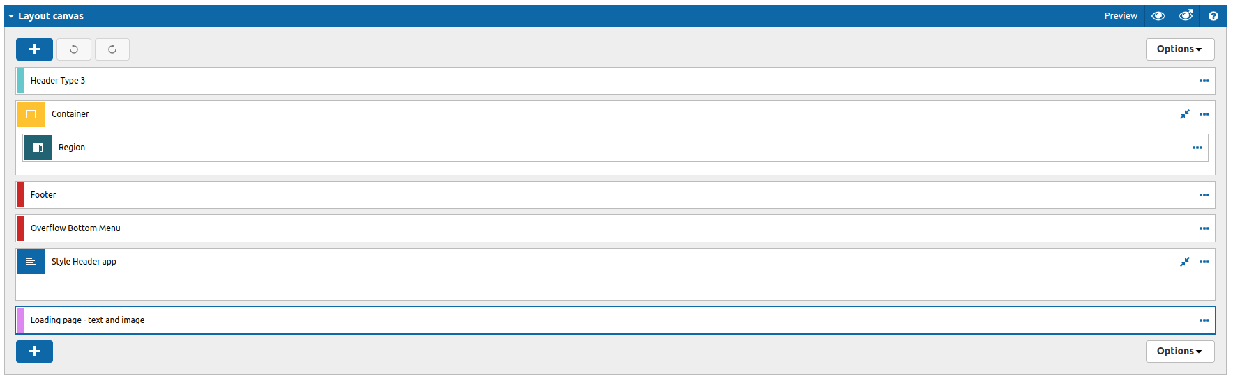
Component structure in Layout Canvas (Master Template):
This component should be used on master template to work accuratly in all the pages.
1. On the master template that you want to add the componento to, click the + on the Layout Canvas;
2. Search the list for the Loading Page - Text and Image component and add it by taking it and dragging it to the Layout Canvas;
Component customization:
1. Double-click on the Loading Page - Text and Image component to edit;
2. Edit the following fields:
TAB: Settings
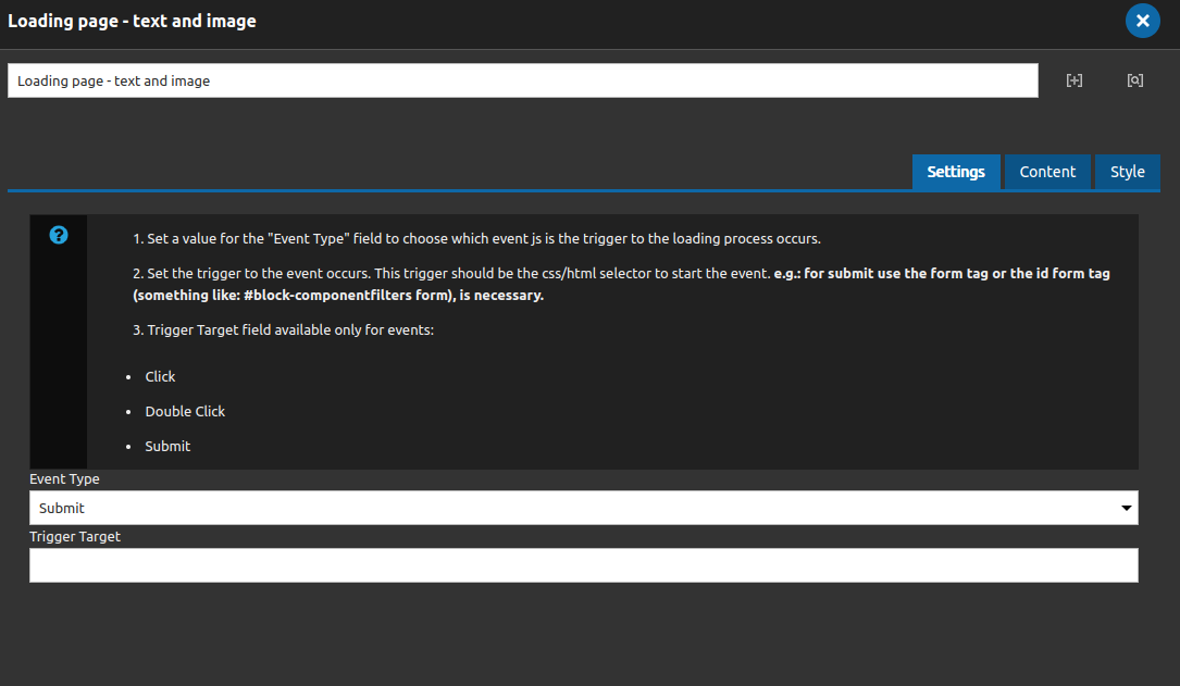
• Event Type:
- Set a value for the "Event Type" field to choose which event js is the trigger to the loading process occurs.
- Set the trigger to the event run. This trigger should be the css/html selector to start the event. e.g.: for submit use the form tag or the id form tag (something like: #block-componentfilters form), is necessary.
- Trigger Target field available only for events:
- Click
- Double Click
- Submit
All events availables for this components: click, double click, submit, before unload, load;
• Trigger Target: Works as a selector from js, use it to select an element or reference to trigger the event.
TAB: Content
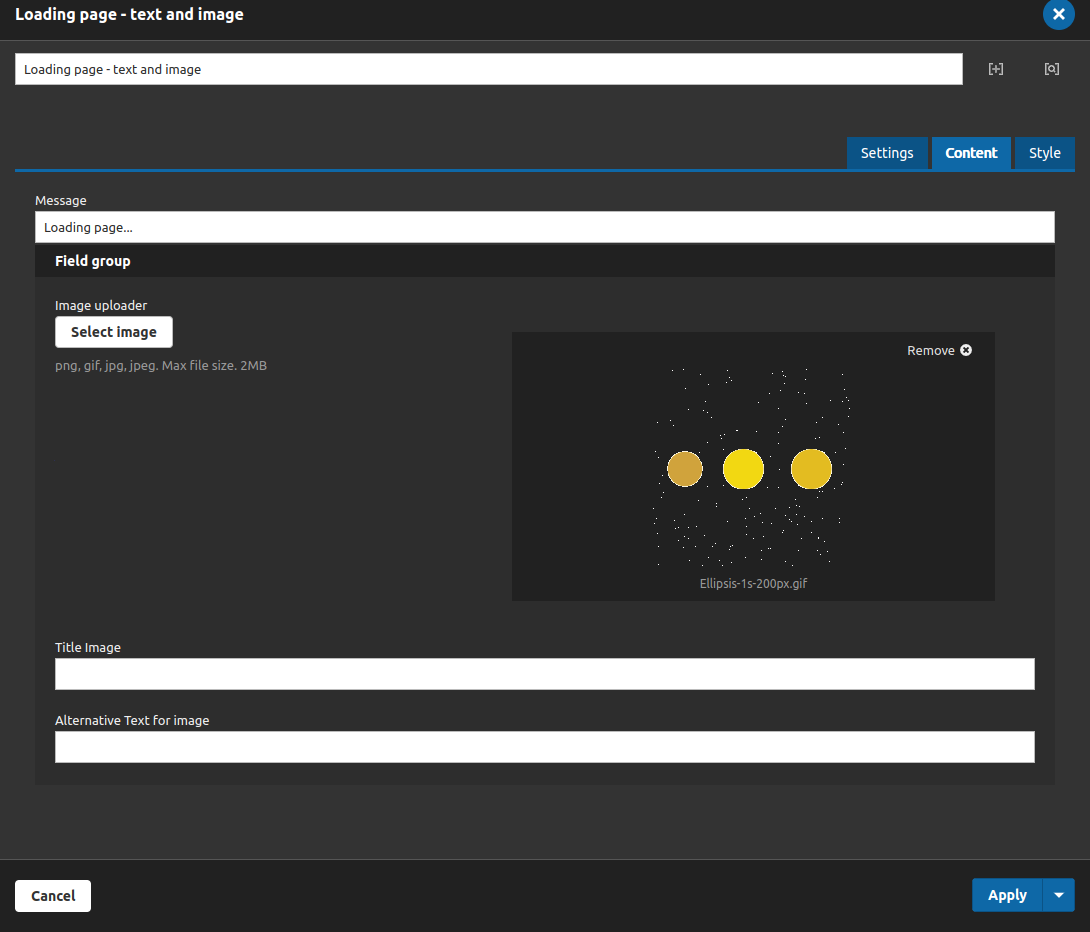
• Message: Set the message to show above the image or gif;
• Image uploader: Add an image to represent some status when event is running;
• Title Image: Add a title to the image;
• Alternative Text for image: Add a alternative text for acessibility;
TAB: Style

The brackground always will have a blur of 8px, but the color you can change on the background color field.
• Background Color: Set the background color for the component;
• Text Color: Set the color for the message;
• Font Size: Set the font size for the message, user only numbers (the system put the px unit automatically);
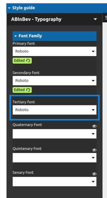
To set your font-family, go to the Appearance > Settings > Core BR - White Label > Style guide > ABinbev Typography > Font Family > Tertiary Font