

Components
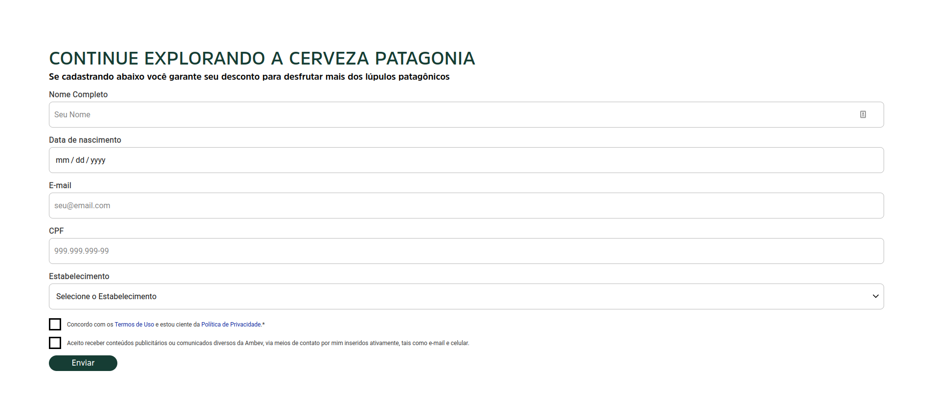
Formulário
A Forms component with customizable appearance, but fixed input fields:
name, date of birth, CPF, phone, e-mail and full address.
• For further customizing, contact the development team.
• Currently, you can only use one form per page.
• There are settings related to CDP and SFMC (Sales Force) and they can only be adjusted manually by these respective teams.
Edited 3 years 6 months ago
Desktop
Input Text Normal
Input
Height: 53px
Outline Border: $outline_border_thin
Border Rádios: $border_radios_small
Border Color: $color_neutral_medium
Color Backgroud: $color_neutral_lightest
Typography
$font_family_2
$font_size_XXS
$font_line_height_short
$font_spacing_defaut
Label text
$font_weight_bold
$color_ neutral_dark
Placeholder text
$font_weight_regular
$color_neutral_medium
Input Text Hover
Input
Height: 53px
Outline Border: $outline_border_thin
Border Rádios: $border_radios_small
Border Color: $color_secondary_medium
Color Backgroud: $color_ neutral_lightest
Typography
$font_family_2
$font_size_XXS
$font_line_height_short
$font_spacing_defaut
Label text
$font_weight_bold
$color_neutral_dark
Placeholder text
$font_weight_regular
$color_neutral_medium
Cursor:
- pointer
Input Text Activated
Input
Height: 53px
Outline Border: $outline_border_thin
Border Rádios: $border_radios_small
Border Color: $color_neutral_medium
Color Backgroud: $color_ netral_lightest
Typography
$font_family_2
$font_size_XXS
$font_line_height_short
$font_spacing_defaut
Label text
$font_weight_bold
$color_neutral_dark
Placeholder text
$font_weight_regular
$color_neutral_dark
Input Type Warn
Input
Height: 53px
Outline Border: $outline_border_thin
Border Rádios: $border_radios_small
Border Color: $color_feedback_warning_medium
Color Backgroud: $color_ neutral_lightest
Typography
$font_family_2
$font_size_XXS
$font_line_height_short
$font_spacing_defaut
Label text
$font_weight_bold
$color_feedback_warning_medium
Placeholder text
$font_weight_regular
$color_ neutral_darkest
Help text
$font_size_XXXS
$font_weight_regular
$color_feedback_warning_medium
Input Text Disabled
Input
Height:53px
Outline Border: $outline_border_thin
Border Rádios: $border_radios_small
Border Color: $color_neutral_medium
Color Backgroud: $color_ netral_lightest
Typography
$font_family_2
$font_size_XXS
$font_line_height_short
$font_spacing_defaut
Label text
$font_weight_bold
$color_neutral_medium
Input Select Activated
Input
Height: 53px
Outline Border: $outline_border_thin
Border Rádios: $border_radios_small
Border Color: $color_neutral_medium
Color Backgroud: $color_ netral_lightest
Typography
$font_family_2
$font_size_XXS
$font_line_height_short
$font_spacing_defaut
Label text
$font_weight_bold
$color_ neutral_dark
Placeholder text
$font_weight_regular
$color_neutral_dark
Icon
-arrow down
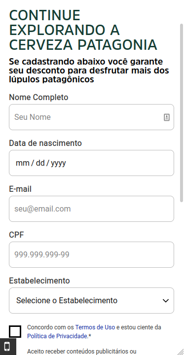
Mobile
Step by Step
Applying the Component:
1. On the page that you want to add a Formulário, click “+” on the Layout Canvas.
2. In the list of components, search for the Formulário, drag, and drop it to the layout.

3. Click twice on the component to customize:
• Título: inform a title for your form.
• Descrição: write a brief description of the form.

Select Webform:
• Entity: search on the list for the Webform that you created in Content.

• Webform - Deprecated: it's not necessary to select anything here.
Timer Settings:
• Time: If you want you can determine the maximum time for filling the form by selecting an option on the list.
• Timer Color/ background color: select a color for the Timer and the background color.

Modal Settings:
• Confirmation title/message: Inform the title and message confirmation that will show after submitting the completed form, on a modal.

• Modal width: Select a size for the Modal where will be displayed the confirmation.


• Show site name: To show the name of your site on the Modal, select ON.
• Call to action: here you can add a link to redirect the user to another page, after to concluded the form. If you want it, select ON, paste the link and inform a text for the Call to action button.

Form Style:
• Form Action align: select an option for the elements alignment.

• General Colors: select the color options that you want to customize your form.

• Input Colors: these colors will be applied on the fields of filling.

• Checkbox: these colors will be applied on the Checkbox items.

• Modal color: choose a color for the Modal Title.

• Font Size: select ON to customize the font size of the title and description, and choose the size for desktop and mobile. Leave OFF, to use a default size.

4. Click on “Apply” to save.
