

Components
Jumbotron
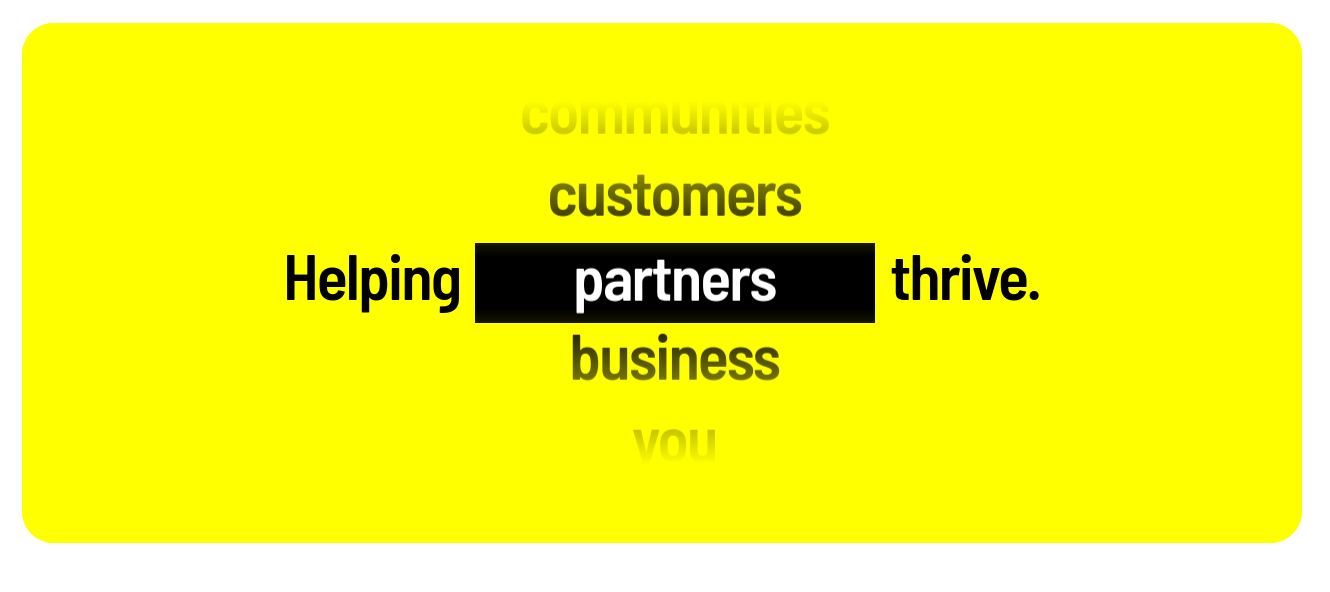
This component allows you to add a dynamic information display component.
The main structure of this component represents a prefix text + a list of words + a suffix text.
Please, take a look at the "examples" tab to have this idea more clearly.
Edited 3 years ago
Desktop
Mobile

Step by step:
1. To add this component, go to the page that you want to add this component, and click the “+” on the Layout Canvas;
2. Search in the list for the Jumbotron and add it by dragging the component into the Layout Canvas;
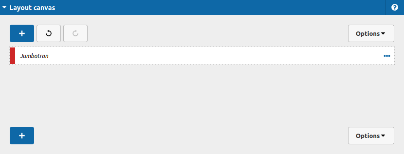
3. Double click at Jumbotron component to configure it:
Let's take a look at the options:
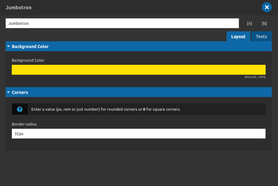
Layout Tab
Background color:
- • Background Color: Choose which color your Jumbotron should have.
Corners:
- • Border-radius: Set the rounded value for your Jumbotron corners.
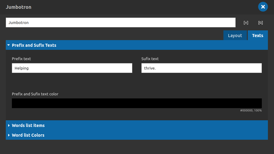
Texts Tab
Prefix and Sufix Texts:
- • Prefix Text: Type the prefix text here.
- • Sufix Text: Type the suffix text here.
- • Prefix and Sufix text color: Choose which color your sufix and prefix content should have.
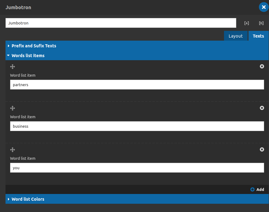
Texts Tab
Words list items:
- • Word List Item: Type the text that you need here.
- • Add: You can add more words to the list if you want to, just need to click on that "add" button.
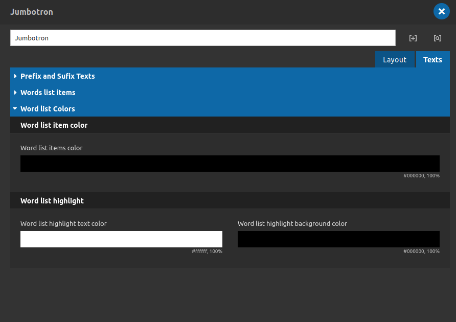
Texts Tab
Words list colors:
- • Word List Item colors: Set the color for your words when its not inside the highlight area.
Words list highlight:
- • Word List highlight text color: Set the color for your words when its inside the highlight area.
- • Word List highlight background color: Set the background color for your highlight area.
4. After that click on "apply" button and save the page to see the component working.
