

Components
Container with Equal Size Items
This component allows you to add elements inside of it with specific sizes and deep control.
Edited 3 years 1 month ago
Desktop
Mobile
Step by step:
1. First, you need to add an Container with Equal Size Items. To do that, go to the page that you want to add this component, and click the “+” on the Layout Canvas;
2. Search in the list for the Container with Equal Size Items and add it by dragging the component into the Layout Canvas;
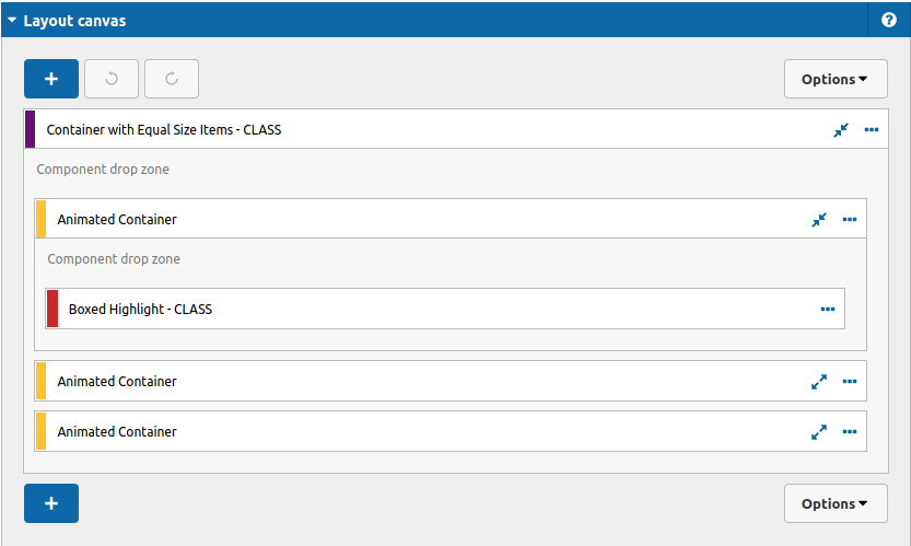
3. After that you can define your settings for this component, take a look:
4. To configure this container, click twice on the component and check the options as you need.
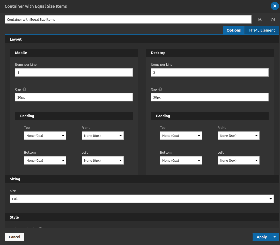
Options Tab
Layout:
- • Items per Line: You can set how many items you're going to see for each line on the page, the component by itself equalize the sizes of its children according to how many items you put inside of it.
- • Gap: Set a value on pixels to define a gap between the elements inside the container.
- • Paddings: You can set the padding of this container singly for mobile and desktop breakpoints.
- Sizing:
- • Size: Set the width dimension of the container itself.
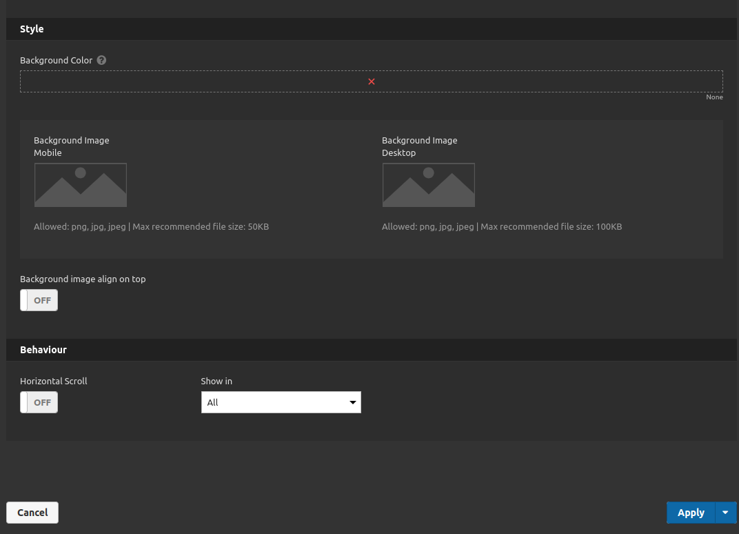
- Style:
- • Background color: You can set background color for your container.
- • Background image: You can set background image for your container (mobile and desktop breakpoints).
- • Background image Align on top: This option apply a little adjustment to the image to be more "centered".
- Behavior:
- • Horizontal scroll: When turned on if you have elements inside the container overflowing the container you can scroll to see them. When turned off the elements equalize their sizes to fit in the container.
- • Show in: set if this container should appear only on mobile or desktop or both (all option).
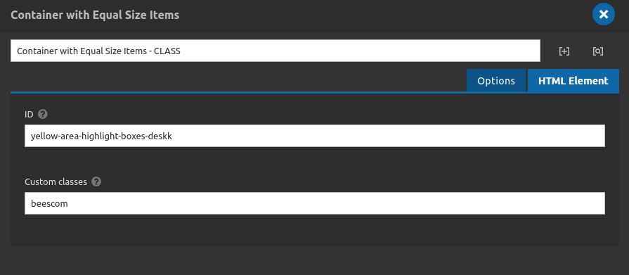
HTML Element Tab
• ID: If you need a Anchor link inside your page to aim at this container, you can use this field to set it. Do not use "#" symbol in front of it, the system do it by itself.
• Custom Classes: If you need classes to do custom extra styles or behaviors you can use this field to add those classes. Separate classes with whitespace. Do not use "." symbol to represent classes, the system do it by itself.
5. After setting your configurations you can click on apply button and check the results.
