

Components
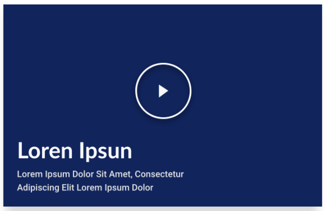
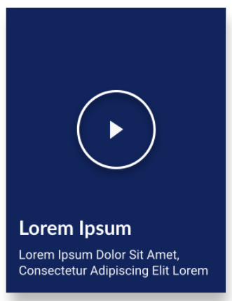
Video Card
A video card that accepts URLS from Youtube and Twitch. The card can also have a text description and CTA inside.
Edited 3 years 6 months ago
Desktop
Mobile
Step by Step
Component structure in Layout Canvas:
1. On the page you want to add the banner to, click the "+" on the Layout Canvas;
2. Search the list for the "Slider Container" component to create the carousel and add it by taking the component and dragging it to the Layout Canvas;
**Note: It doesn't matter if you want to add just one image card or various image cards, you need to add the container above.
3. Now, inside the "Slider Container", insert as many "Video Card" components as you want.

**Note: If you want a carousel with text on the side, view the "Title and CTA Container" manual, which shows how to add one.
Component customization:
1. Click twice on the component, and select the options that you want.
Card Content:
• Card size: Select the desired card size: small, medium or large.
• Background: select a image to be used as the card's background.
• Aria-label: this defines a string to describe the element. It’This is important for accessibility resources.
• Gradient: select “On” if you want a gradient color on your card. Choose a color and select a boundary for the gradient (higher the value, bigger the card area that the gradient will cover).

• Text info:
- ◦ Title : Inform the card title.
- ◦ Description: inform the description of the card.
- ◦ Text Color: select the font color for the title and description.

• Video: select the provider of your video and paste the URL to embed your video.

Modal Configuration:
◦ Modal overlay transparent: this is the background when the video is played. Choose if you want a solid or transparent color.
◦ Modal overlay background color: choose a color for the background.
◦ Modal close button color: choose a color for the Modal "close" button.

• HTML Element ID: An identifier that must be unique throughout the site. Your goal is to identify the element when navigating anchors. Anchoring allows the current element to be accessed through links and/or buttons, as long as they belong to the same domain (site).
Only the modal's color can be changed.
Video's text can be changed on CkEDitor
