Components
Swiper Vertical
This component allows you to add a dynamic swiper of contents in a section or column.
Edited 3 years ago
Desktop

Mobile

Step by step:
1. First, you need to add an Swiper Vertical. To do that, go to the page that you want to add this component, and click the “+” on the Layout Canvas;
2. Search in the list for the Swiper Vertical and add it by dragging the component into the Layout Canvas;
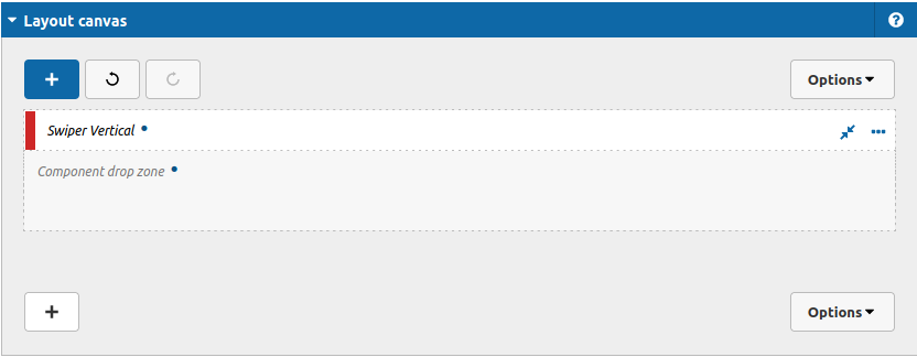
3. Double click at Swiper Vertical to configure it:
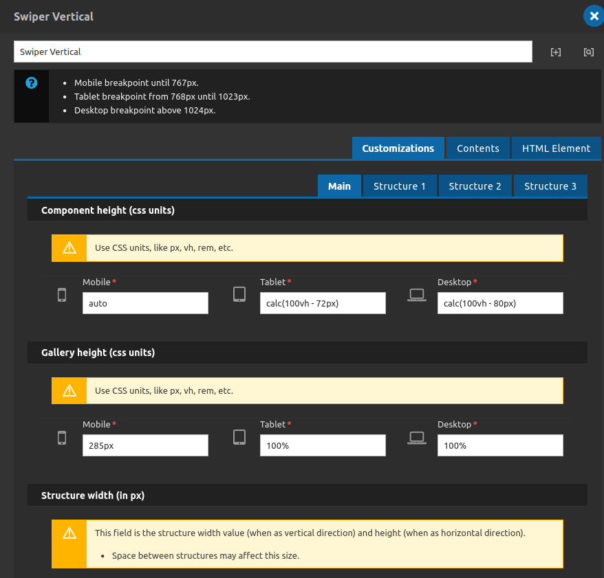
Customizations Tab - Main subTab
Main options for the style of the component.
Component Height (css units):
- • Mobile: Set the height of the whole component at mobile devices.
- • Tablet: Set the height of the whole component at tablet devices.
- • Desktop: Set the height of the whole component at desktop devices.
Gallery Height (css units):
- • Mobile: Set the height of the gallery area at mobile devices.
- • Tablet: Set the height of the gallery area at tablet devices.
- • Desktop: Set the height of the gallery area at desktop devices.
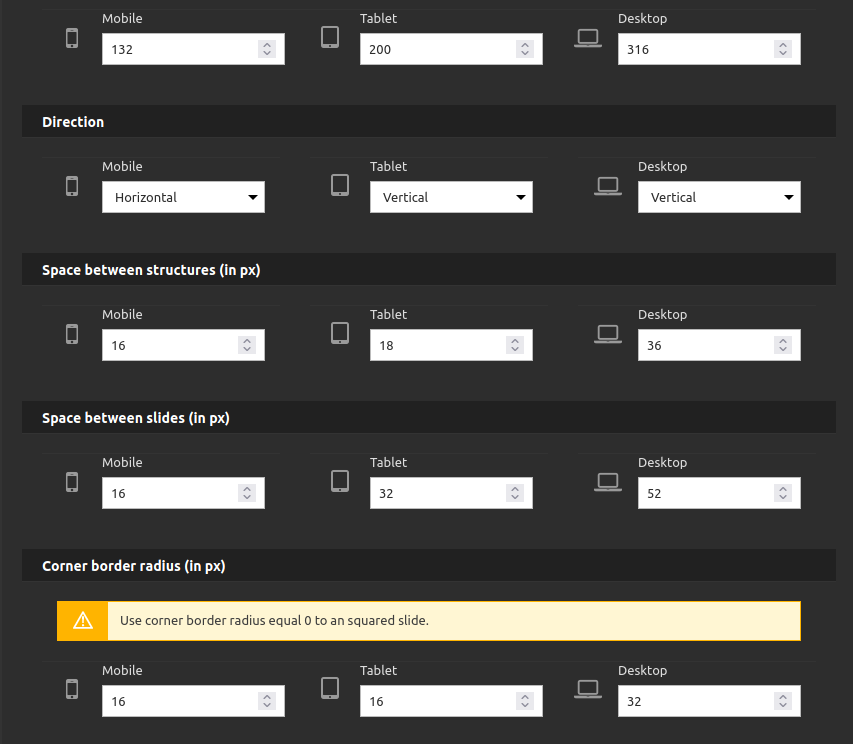
Structure Width (in px):
- • Mobile: Set the width of the column at mobile devices.
- • Tablet: Set the width of the column at tablet devices.
- • Desktop: Set the width of the column at desktop devices.
Direction:
- • Mobile: You can set if the swiper will be organized in vertical direction or horizontal direction (for mobile).
- • Tablet: You can set if the swiper will be organized in vertical direction or horizontal direction (for tablet).
- • Desktop: You can set if the swiper will be organized in vertical direction or horizontal direction (for desktop).
Space between Structures (in px):
- • Mobile: You can set the value in px of the gap space between each structure (column or row) (mobile).
- • Tablet: You can set the value in px of the gap space between each structure (column or row) (tablet).
- • Desktop: You can set the value in px of the gap space between each structure (column or row) (desktop).
Space between slides (in px):
- • Mobile: You can set the value in px of the gap space between each slide (mobile).
- • Tablet: You can set the value in px of the gap space between each slide (tablet).
- • Desktop: You can set the value in px of the gap space between each slide (desktop).
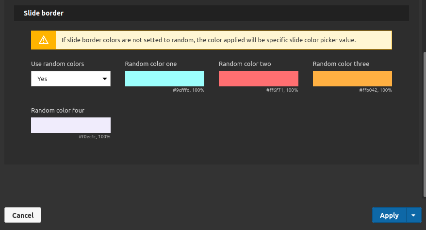
Slide border:
- • Use ramdom colors: Choose if you wan to use a border random color or not. If slide border colors are not setted to random, the color applied will be specific slide color picker value (inside the contents tab).
- • Random Color one: Choose the first color to compose the border random colors.
- • Random Color two: Choose the second color to compose the border random colors.
• Random Color three: Choose the third color to compose the border random colors.
• Random Color four: Choose the fourth color to compose the border random colors.
Note: If you want to build your random border color with less colors then 4, you can repeat the colors. E.g.: if you want to use 2 colors only, you can select the same color for the field one and two, and for the second color select the same at the field three and four.
4. After you have done the style settings, go to one of the structures tabs to set the individual speed and direction:
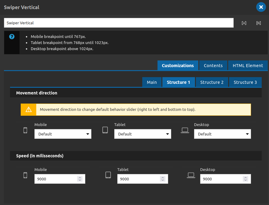
The 3 structures have the same fields to define. Remember when we say structure it could be a column or a row depending of the configuration that you made in the main tab > Direction area
Customizations Tab - Structures subTabs
Movement Direction:
Its used to override the default behavior of the slider/swipper (which is right to left and bottom to top).
- • Mobile: You choose between default or reverse option - reverse will change to left to right and top to bottom. (mobile)
- • Tablet: You choose between default or reverse option - reverse will change to left to right and top to bottom. (tablet)
- • Desktop: You choose between default or reverse option - reverse will change to left to right and top to bottom. (desktop)
Speed (in milisseconds):
- • Mobile: Set the speed of the structure at mobile devices.
- • Tablet: Set the speed of the structure at tablet devices.
- • Desktop: Set the speed of the structure at desktop devices.
5. After that you can set the contents for the swiper:
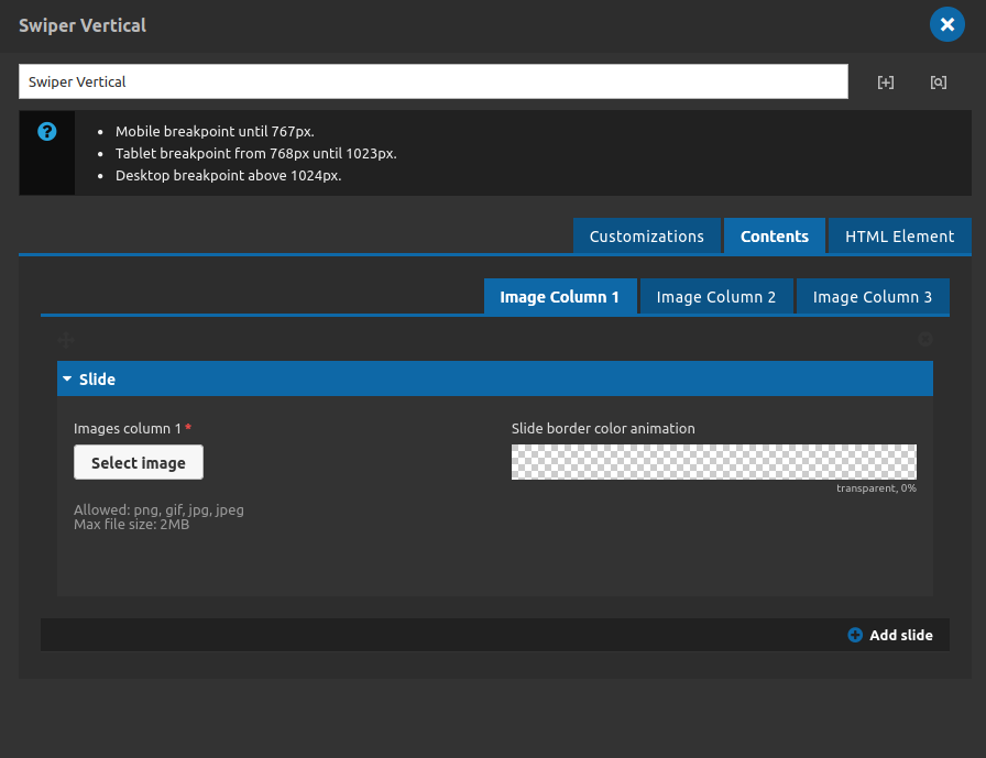
You can add a image and its border color.
Also you can add more images for each structure clicking at "add slide".
6. At the HTML element tab you can add a id for you component or classes to override the style as you need, the id field its the best option for when you want to anchor any link on the page to your swiper.
7. Finally you can apply and save the component.
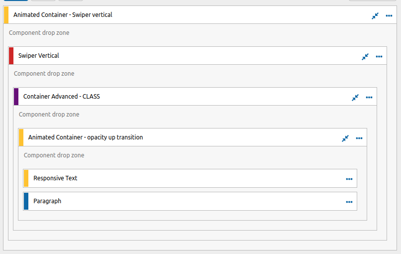
Note: This component works as a container/section of the page, so you have its own settings and contents, but you can drag and drop another components inside of it, take a look at this example: