

Components
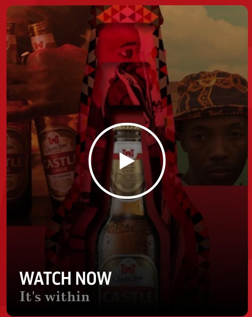
New Video Card
This component allows you to embed video in your website. It only accepts URLs from YouTube or Twitch
Edited 3 years 5 months ago
Desktop

Mobile
Step by Step
1. On the page you want to add the component, click the “+” in the Layout Canvas;
2. Search for the "New Video Card" component to create the carousel and add it by taking the component and dragging it to the Layout Canvas;
**Note: It doesn't matter if you want to add just one video card or various video cards, you need to add the container above.
3. And inside the "New Video Card", insert the New Video Card, which can be n (variable by the number of items you want inside the carousel).

**Note: If you want a carousel with text on the side, view the "Title and CTA Container" manual, which shows how to add it.
Customizing the Component:
1. Click twice on the component to set your prefers:
• Card Configuration
◦ Border radius: select a size if you want a border rounded
◦ Size - Video Card: choose an option for the size of the card
◦ Card shadow: select “on” if want a shadow on the card

◦ Margin top/bottom and left/right: define the space between the border of the card and the border of the container component.
◦ Padding top/bottom and left/right: define the space between the elements inside the card (as text and title) and the border of the card.

◦ Background image: select an image for the background mobile and desktop.

** Note: pay attention to the resolution recommended for each size of card for the desktop background. Example: if you selected Small as a Size - Video Card, the resolution must be 370x360.
◦ Gradient: select “on” if you want a gradient color on your card. Choose a color and select a boundary for the gradient.

- • Card Text
◦ Text color: select a color for the texts on the card.
◦ Heading element: select type of the heading.
◦ Title: write the title that will be shown on the card.

◦ Description: write a description of your video, it’s positioned just below the title. Here you can choose the format options for the text.

• Video Configuration
◦ Provider: select the provider of your video.
◦ URL - Video card: paste here the URL to embed your video.

• Modal Configuration:
◦ Modal overlay transparent: this is the background for when the video is played. Choose if you want a solid or transparent color.
◦ Modal overlay background color: choose a color for the background.
◦ Modal close button color: choose a color for the button of Modal.

2. Check your options and click “Apply” to save all.
3. To customize the Slider Container or other container component, check the specific instructions for the component.
