

Components
Container Advanced
Use this container to group components together or have them nicely arranged. Also, you can use an image as a background to make the Container look like a Banner.
Edited 3 years 5 months ago
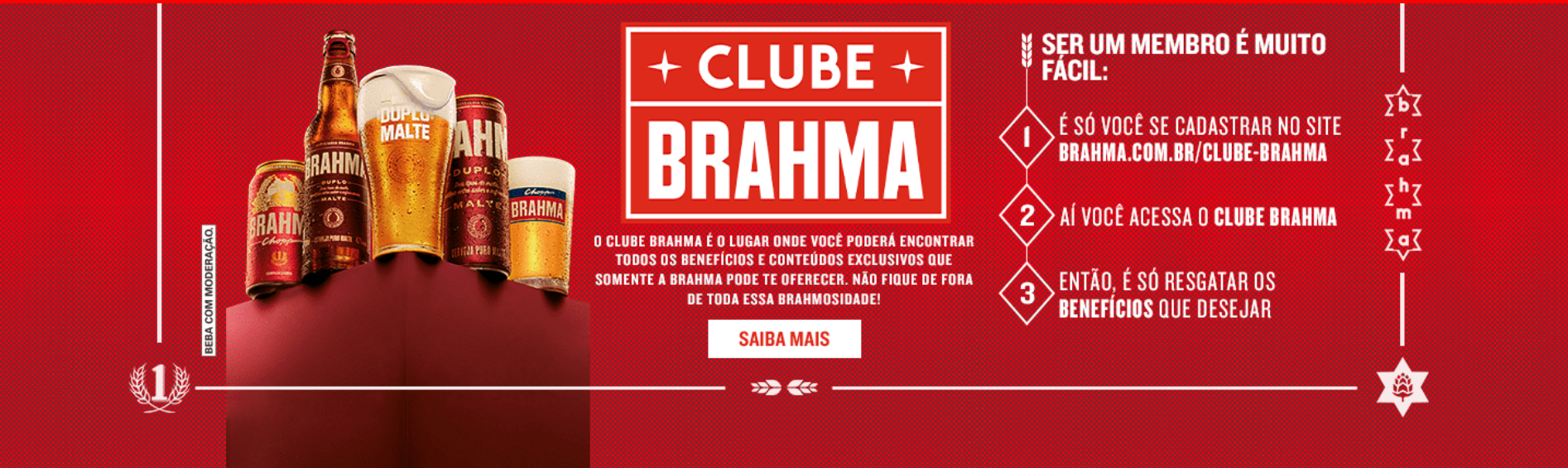
Desktop
Mobile

Step by Step
1. On the page that you wish to add the Container Advanced component, click the + button on the Layout Canvas;
2. Search the Container Advanced component on the list, it is located in the "Container Components" category;
3. Drag and drop the component inside the canvas, and make sure to put it exactly where you wish to place it.

4. You can add others components, just search on the components list, drag and drop to the drop zone of Container Advanced.

Customizing the Component:
1. Click twice on the component and set your prefers:
• Dimension:
- ◦ Size: choose if want Full, Boxed, or custom size.
- ◦ Padding Mobile/Desktop: select the padding options for mobile and desktop format.
- ◦ Content Alignment: select “ON” to modify the alignment and choose an option (left, right, center).

• Style:
- ◦ Background color: Choose an option if you want a solid color as the background
- ◦ Background image: select a file if you want an image as the background
- ◦ Background image align on top: select “ON” if you want the image aligned on top.

- • Behavior:
-
- ◦ Horizontal scroll: select if you want the content scrolling on the horizontal.
- ◦ Show in: select if you want this behavior on the desktop, mobile, or both. This setting can affect page performance and the anchor menu will not work.

2. To finish, click on the “Apply” button.
