

Components
Boxed Highlight
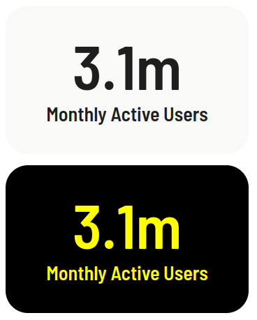
This simple component can provide you a way to highlight some information that you consider important.
Edited 3 years ago
Desktop
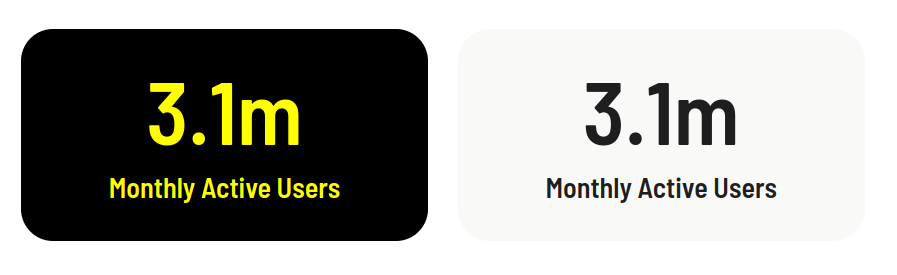
Mobile
Step by step:
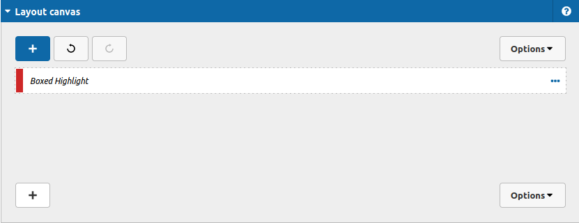
1. First, you need to add an Boxed Highlight. To do that, go to the page that you want to add this component, and click the “+” on the Layout Canvas;
2. Search in the list for the Boxed Highlight and add it by dragging the component into the Layout Canvas or your container component;
Let's see the options to customize the information that you want to show:
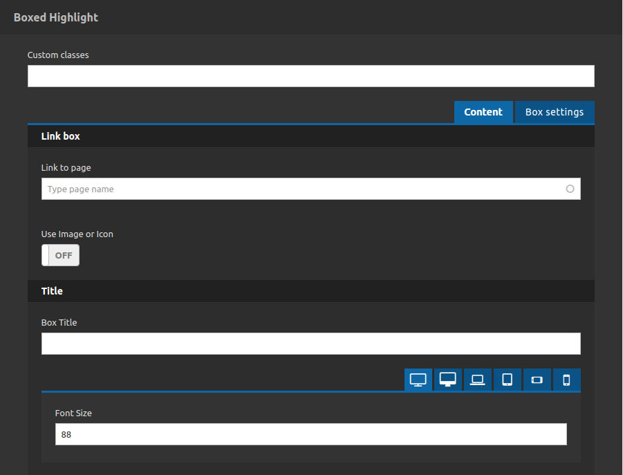
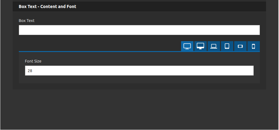
As you can see, you can set the content of the box (title and text), control its font size for each breakpoint and set a link for when you click at the box.
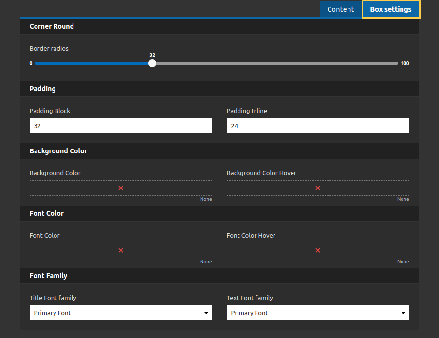
About the styles, you can set a color for the text, background and background when the mouse is over the box. Set a padding for the box, and control the borders radius corners.
Furthermore, you can count with the classes field, where you can put any class for a custom plus style.
We recommend you to use this component inside of the following components:
* Container with Equal Size Items
* Container Advanced
* Animated Container
