

Components
Banner Image
The Banner Image component can be used to highlight contents and campaigns, and generally goes on the top of the page. The banner can have a background, title, text and button added on top of it.
You can combine Slider Container with Banner Image to make a slider of banners.
Edited 3 years 6 months ago
Desktop

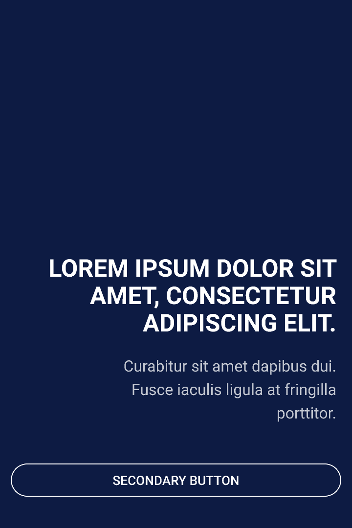
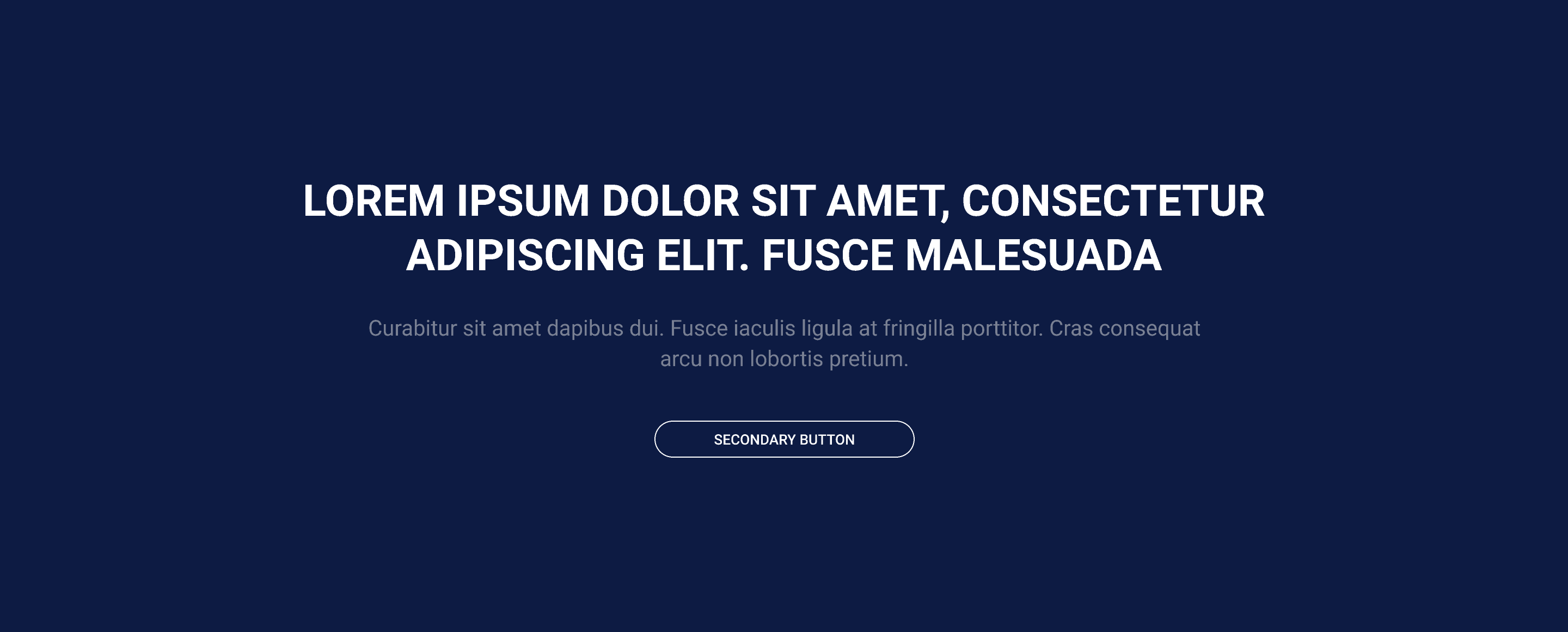 Banner_cta_desktop_Center
Height: P: 480px M: 580px G: Full Viewport (depois do header)
textAlign: center content-box: widht 770px - valor máximo
Typography H1: $font_family_1 $font_weight_bold $font_size_xxl $font_line_height_short $font_spacing_defaut Typography Text: $font_family_2 $font_weight_bold $font_size_xxs $font_line_height_long $font_spacing_defaut |
 Banner_cta_desktop_Left
Height: P: 480px M: 580px G: Full Viewport (depois do header)
textAlign: left content-box: widht 472px
Typography H1: $font_family_1 $font_weight_bold $font_size_xxl $font_line_height_short $font_spacing_defaut
Typography Text: $font_family_2 $font_weight_regular $font_size_xxs $font_line_height_long $font_spacing_defaut |
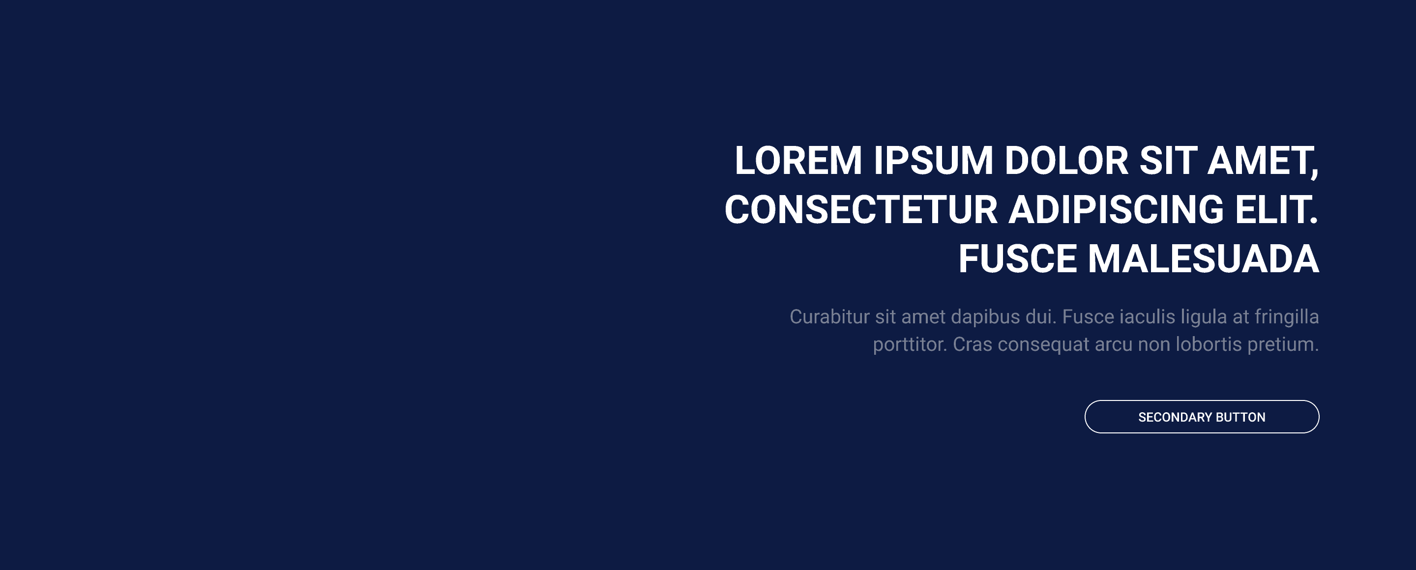 Banner_cta_desktop_Right
Height: P: 480px M: 580px G: Full Viewport (depois do header)
textAlign: right content-box: widht 472px
Typography H1: $font_family_1 $font_weight_bold $font_size_xxl $font_line_height_short $font_spacing_defaut Typography Text: $font_family_2 $font_weight_regular $font_size_xxs $font_line_height_long $font_spacing_defaut |
Mobile

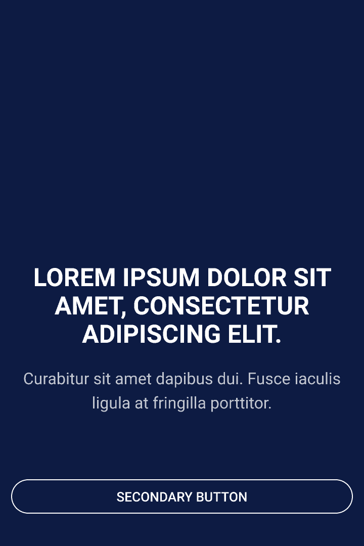 Banner_cta_mobile_Center
Height: P: 440px M: 540px G: Full Viewport (depois do header) VerticalAlign: middle HorizontalAlig: center
Typography H1: $font_family_1 $font_weight_bold $font_size_l $font_line_height_short $font_spacing_defaut Typography Text: $font_family_2 $font_weight_regular $font_size_xxs $font_line_height_long $font_spacing_defaut |
 Banner_cta_mobile_Left
Height: P: 440px M: 540px G: Full Viewport (depois do header)
VerticalAlign: bottom HorizontalAlig: left
Typography H1: $font_family_1 $font_weight_bold $font_size_l $font_line_height_short $font_spacing_defaut Typography Text: $font_family_2 $font_weight_regular $font_size_xxs $font_line_height_long $font_spacing_defaut |
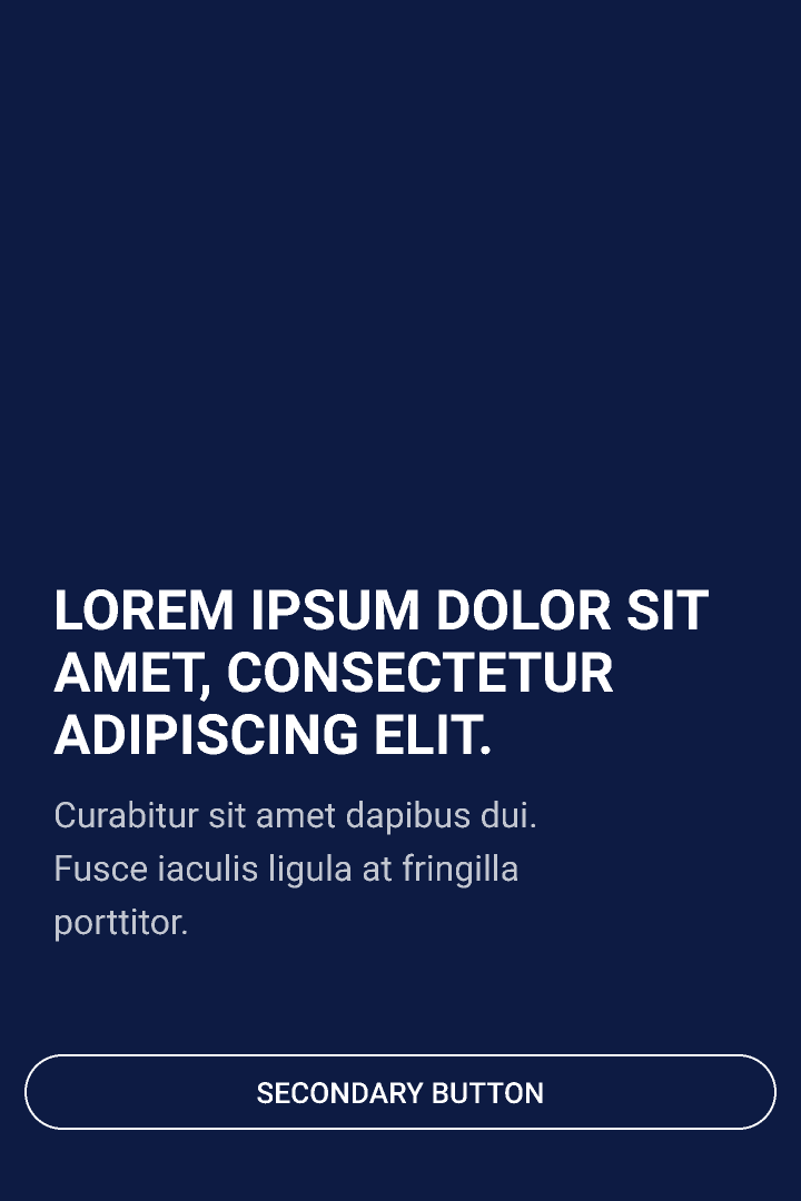
 Banner_cta_mobile_Right
Height: P: 440px M: 540px G: Full Viewport (depois do header)
VerticalAlign: bottom HorizontalAlig: right
Typography H1: $font_family_1 $font_weight_bold $font_size_l $font_line_height_short $font_spacing_defaut Typography Text: $font_family_2 $font_weight_regular $font_size_xxs $font_line_height_long $font_spacing_defaut |
Step By Step
Component structure in Layout Canvas:
1. On the page you want to add the banner click the "+ "on the Layout Canvas.
2. Search the list for the Banner Container component and add it by taking the component and dragging it
to the Layout Canvas.
3. Insert the Banner Image component inside the Banner Container, being able to add n images inside the container;

Component customization:
1. Double-click on the Banner Image you want to edit.
Slide Configuration:
-
• Destination (URL and #anchor): Enter the URL or the anchor id to redirect the click. If you want to use the button, its URL must be informed in this field.
-
• Target
-
◦ Same Window: Select this option if you want the URL informed in "Destination" to open in a new browser tab;
-
◦ New Window: Select this option if you want the URL entered in "Destination" to open in the same browser tab.

-
-
• Background Shadow: Activate the button if you want the banner image to have a black mask over the image. This option exists if the image and text do not provide enough contrast for reading.

-
-
• Desktop/Mobile Image: Add Desktop and mobile Banner images.

-
-
• Aria-label: this defines a string to describe the element. It’s important for accessibility resources.
-
• Image Height
-
◦ Select S: 480px to Desk and 440px to Mobile;
-
◦ Select M: 580px to Desk and 540px to Mobile;
-
◦ Select L: 787px to Desk and 662px to Mobile.

-
Call to Action (Text block) - Optional:
-
• Desktop Block Alignment: Select text placement, the examples you find within ZeroHeight;
- • Horizontal Alignment: choose an alignment option, left or right.
- • Vertical Block Alignment: choose an alignment option, top center, or bottom.

-
Title:
-
• Slide Heading Element: Inform if the banner title will receive the attribute as Heading 1, Heading 2, Heading 3. Pay attention to the selection as it directly impacts the SEO.
-
• Text: Add the text that will appear in the banner title.
-
• Title Font Size: Font sizes range from XXXS to XXL. Use ZeroHeight to get the size specifications.
-
• Color: Select the font color, using the color of your brand palette as a base.
-

-
-
Paragraph:
-
• Text: Add the text that will be displayed in the banner description.
-
• Title Font Size: Font sizes range from XXXS to XXL. Use ZeroHeight to get the size specifications.
-
• Color: Select the font color, using the color of your brand palette as a base.

-
Button: Next, we can choose that the button redirects to a link OR that the user can download a file directly (which needs to be uploaded to "Media" previously).
-
-
-
• Text: Inform the text that will be displayed on the button.
-
• Title: Add the title of the HTML tag. This will impact Google Analytics.
-
• Style: There are options for Primary, Secondary, and Tertiary. Within them, there is variation in size (from small to large) and Dark / Light. For all the variations I mentioned earlier, you can check their layout on your brand's ZeroHeight (In Buttons> Applications).
-
• Color: We do not recommend using this feature as it changes the color of the button and border text. This feature exists only in case of need.
-
** Note: To add the redirect button, register the link in Slide Configuration> URL Destination!
-

Button - Download:
• Entity: After adding in "Media" the file that the user can download when clicking on the button, inform in this field; To know how to upload a media file click here.
-
-
• HTML Element ID: Inform the HTML ID.


Title and Description can be changed directly on the component.
The banner has no overlay or gradient.
