

Components
Title and CTA Container
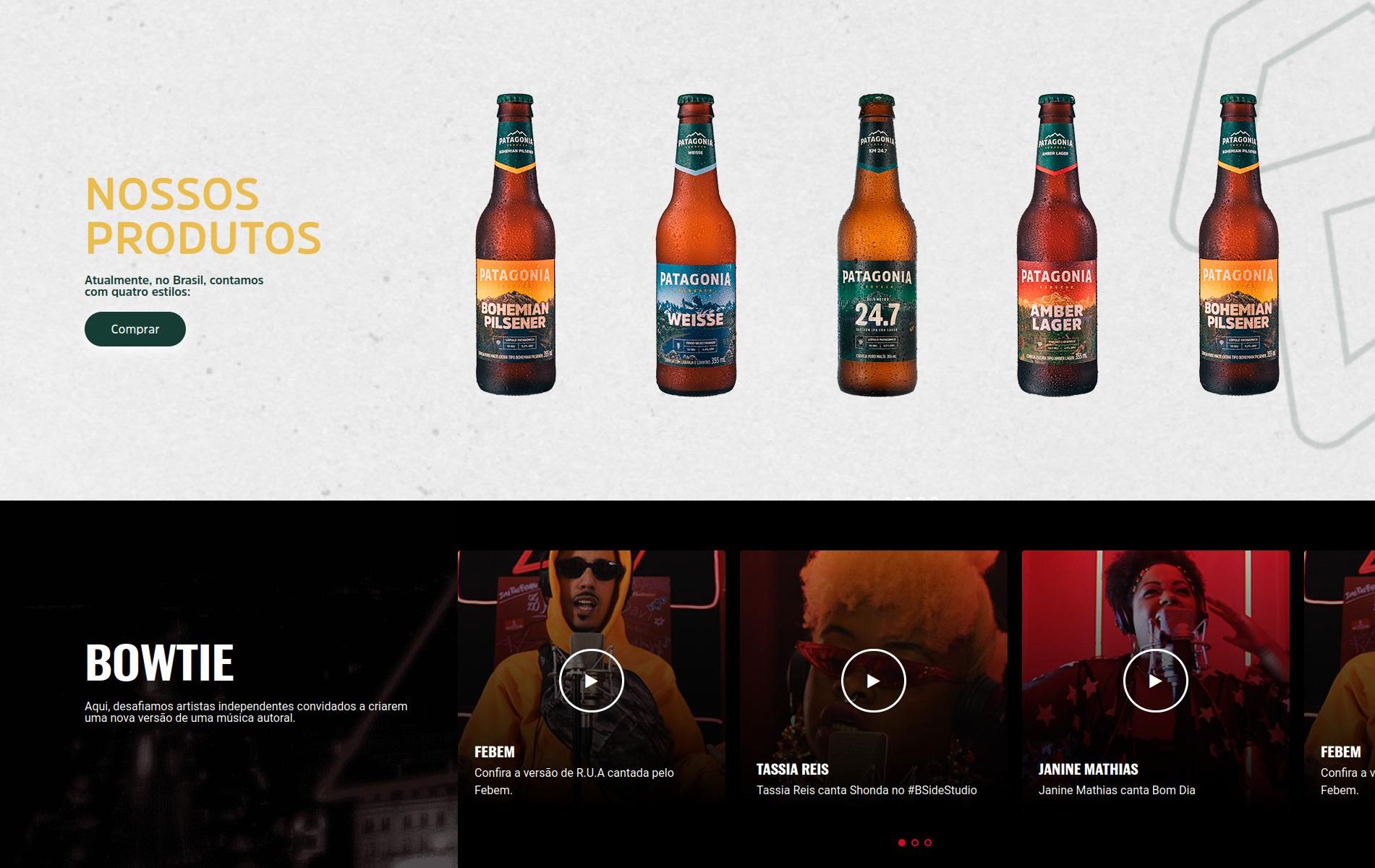
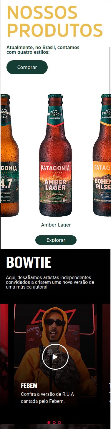
This component is used to place text (with or without a button) on one side, and content on the other.
Edited 4 years ago
Desktop
Mobile
Step by Step
1. On the page that you wish to add the Title and CTA container component, click the + button on the Layout Canvas;
2. Search the Title and CTA container component on the list, it is located in the "Container Components" category;
3. Drag and drop the component inside the canvas, and make sure to put it exactly where you wish to place it.

Customizing the Component:
1. Click twice on the component and set your prefers:
• Container configuration:
◦ Columns direction: choose if you want the text on the left or on the right
- ◦ Columns configuration: choose a size for each column, the total size must be 100%.

- ◦ Background color: Choose an option if you want a solid color as the background
- ◦ Background image: select a file if you want an image as the background
- ◦ Aria label: this defines a string to describe the element. It’s important for accessibility resources.

• Call to action - text:
◦ Heading Text: write a text for the heading, it’s like a title.

- ◦ Paragraph text: add a text on your component.
- ◦ Paragraph style: select a style option.
- ◦ Paragraph text color: choose a color for the paragraph text.

• Button:
◦ Button text: if you want a button on your container, write a text here.
◦ Button title: the name for when the cursor is positioned on the button
◦ Button style: choose a style for the button
◦ Button Aria-label: this defines a string to describe the element. It’s important for accessibility resources

◦ Page URL: inform a page or paste an URL to embed a link on the button
◦ Button target: choose an option
- New window: When selecting this option, the link will open in the same tab as the user's browser. This option is recommended for internal links (site links);
- Same window: When selecting this option, the link will open in a new browser tab. This option is recommended for external links (other sites).

◦ Button - download: inform an Entity if you want to add a button for the download

2. To finish, click on the “Apply” button.

