

Components
Tab with image content
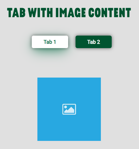
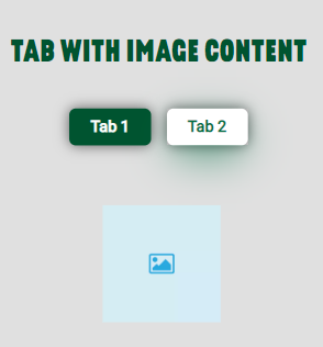
With this component, you can create sections on your page by using tabs with images inside. It is also possible to add links in these images to use them as shortcuts.
Edited 3 years 6 months ago
Desktop
Mobile
Step by Step
1. In the Layout Canvas, click on the “+” button, search for the Tab with image content in the Components list and insert it on the Canvas.

2. To configure it, click twice on the component:
Title and Background settings:
• Component Title:
◦ Title: inform a title that will be above the tabs.
◦ Text color: select a color for the title.
◦ Title size: move the slider to select a size for the title for mobile and desktop.

• Component Background color: choose a color for the background.

Tab Settings:
• Default behavior: choose default colors for the label and the background of the tab.

• Hover behavior: choose a text and background color for the hover effect on the tab label

• Tab Generator:
◦ Tab Border: select "On" if you want to add a border radius.

◦ Tab name: inform a label for the Tab
◦ Image uploader: upload an image for the tab
◦ Image Title/Alt: inform a name and a description for the image. These are important for SEO and accessibility resources.
◦ Link for this image: for the image to work as a shortcut, paste an URL link on the field.

• Add more Content to this Tab: by clicking on this option, it's possible to add more than one image content inside the Tab.
• Add more Tab: to add another tab, click on this option.

3. To save the customizations, click on "Apply".
