

Components
Entity Card Reference - "News" Bundle Type
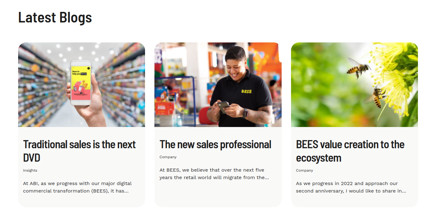
This card component gives you an option to select and highlight a specific "News" Content published. So you have a structure (sections, pages) where you can select manually each News content that you want to show to the user and shows up it with a specific view mode from Drupal.
Edited 3 years ago
Desktop
Mobile
Step by step:
1. First, you need to add an Entity Card Reference - "News" Bundle Type. To do that, go to the page that you want to add this component, and click the “+” on the Layout Canvas;
2. Search in the list for the Entity Card Reference - "News" Bundle Type and add it by dragging the component into the Layout Canvas;
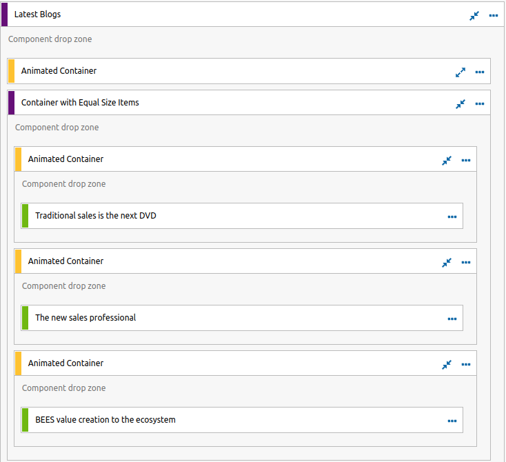
3. After that you can take a look on the options:
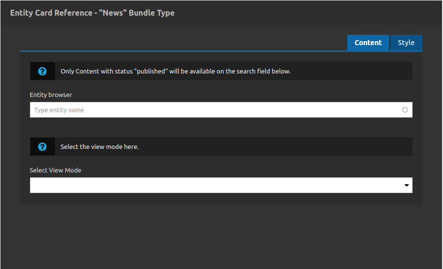
Content Tab
- • Entity Browser: At this field you can search for any internal title of News content that you have inside your site. All of it will be available if its is published (you will not find nodes with archive or draft status).
- • Select View Mode: View modes in drupal are a way to separate groups of fields of contents for different purposes. E.G.: you can have 3 fields to represent a resume of your content (something like title, description and image).
- So you can have different structures of news fields for each view mode, this field allows you to attach a view mode to your card, which means that you are bring only specific field contents to show.
- Note 1: The path to check and add new view modes to your site is: /admin/structure/display-modes/view
- Note 2: For this component you only will have the options of view modes setted to the News Content type.
-
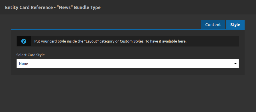
Style Tab
- • Select Card Style: Select a custom style for your card.
- Important note: this component gives you more control about your card appearance (including style behaviors according to the breakpoint) so to do that you need to create a new custom style (url path: /admin/cohesion/styles/cohesion_custom_styles), inside of one of these categories: Layout or Generic, if you do not put your custom style inside these categories your won't be able to select it.
3. After that you click on "apply" button and repeat the same process for others cards if you need.
Recommendations:
• Grid separations like 2 or 3 columns with cards inside of it you can control with other components, like Advanced Container.
• Pay attention to the responsive behavior, its important to do some tests when you are attaching a custom style to this component.
