

Components
Webform w/ Options
Choose a form from several templates and further personalize it to fit your needs.
Edited 3 years 6 months ago
Desktop
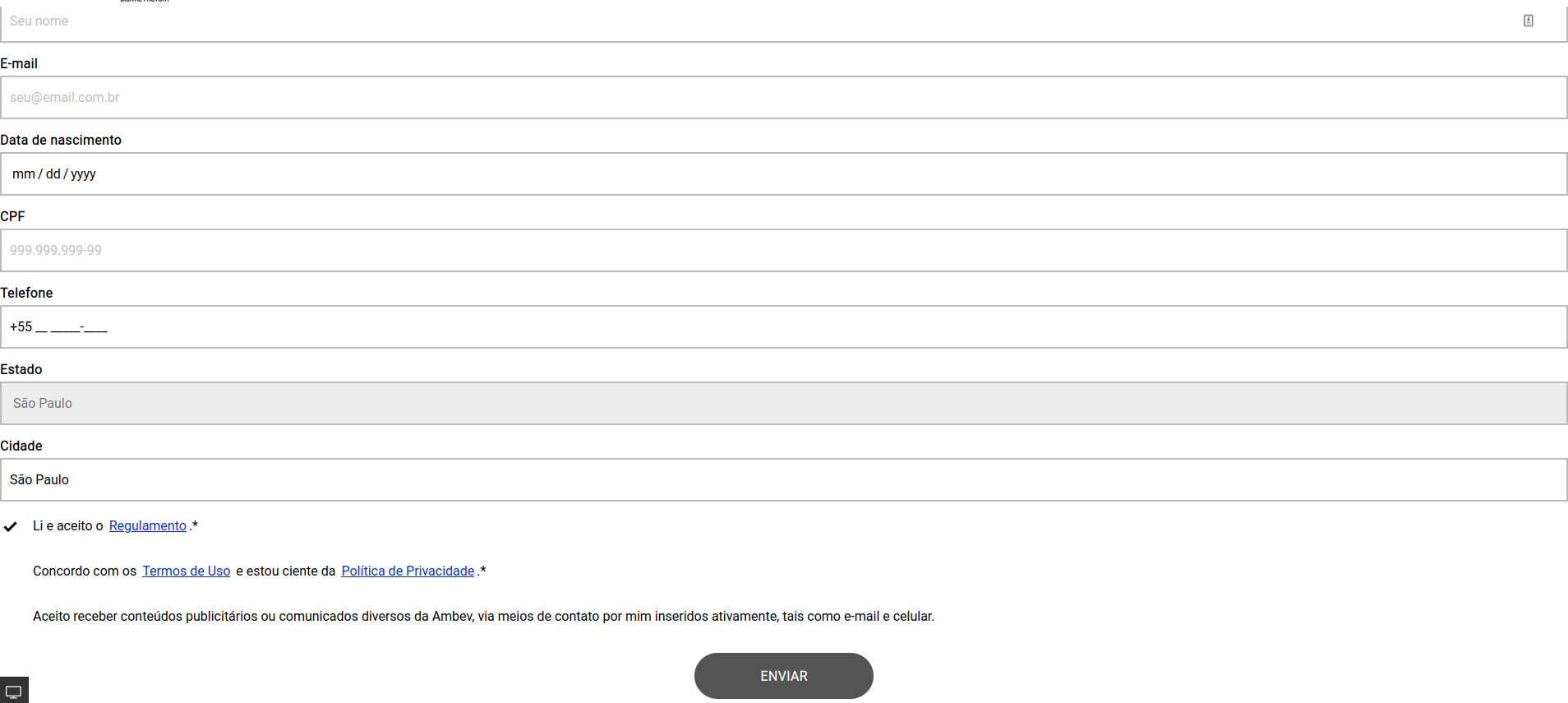
Input Text Normal
Input
Height: 53px
Outline Border: $outline_border_thin
Border Rádios: $border_radios_small
Border Color: $color_neutral_medium
Color Backgroud: $color_neutral_lightest
Typography
$font_family_2
$font_size_XXS
$font_line_height_short
$font_spacing_defaut
Label text
$font_weight_bold
$color_ neutral_dark
Placeholder text
$font_weight_regular
$color_neutral_medium
Input Text Hover
Input
Height: 53px
Outline Border: $outline_border_thin
Border Rádios: $border_radios_small
Border Color: $color_secondary_medium
Color Backgroud: $color_ neutral_lightest
Typography
$font_family_2
$font_size_XXS
$font_line_height_short
$font_spacing_defaut
Label text
$font_weight_bold
$color_neutral_dark
Placeholder text
$font_weight_regular
$color_neutral_medium
Cursor:
- pointer
Input Text Activated
Input
Height: 53px
Outline Border: $outline_border_thin
Border Rádios: $border_radios_small
Border Color: $color_neutral_medium
Color Backgroud: $color_ netral_lightest
Typography
$font_family_2
$font_size_XXS
$font_line_height_short
$font_spacing_defaut
Label text
$font_weight_bold
$color_neutral_dark
Placeholder text
$font_weight_regular
$color_neutral_dark
Input Type Warn
Input
Height: 53px
Outline Border: $outline_border_thin
Border Rádios: $border_radios_small
Border Color: $color_feedback_warning_medium
Color Backgroud: $color_ neutral_lightest
Typography
$font_family_2
$font_size_XXS
$font_line_height_short
$font_spacing_defaut
Label text
$font_weight_bold
$color_feedback_warning_medium
Placeholder text
$font_weight_regular
$color_ neutral_darkest
Help text
$font_size_XXXS
$font_weight_regular
$color_feedback_warning_medium
Input Text Disabled
Input
Height:53px
Outline Border: $outline_border_thin
Border Rádios: $border_radios_small
Border Color: $color_neutral_medium
Color Backgroud: $color_ netral_lightest
Typography
$font_family_2
$font_size_XXS
$font_line_height_short
$font_spacing_defaut
Label text
$font_weight_bold
$color_neutral_medium
Input Select Activated
Input
Height: 53px
Outline Border: $outline_border_thin
Border Rádios: $border_radios_small
Border Color: $color_neutral_medium
Color Backgroud: $color_ netral_lightest
Typography
$font_family_2
$font_size_XXS
$font_line_height_short
$font_spacing_defaut
Label text
$font_weight_bold
$color_ neutral_dark
Placeholder text
$font_weight_regular
$color_neutral_dark
Icon
-arrow down
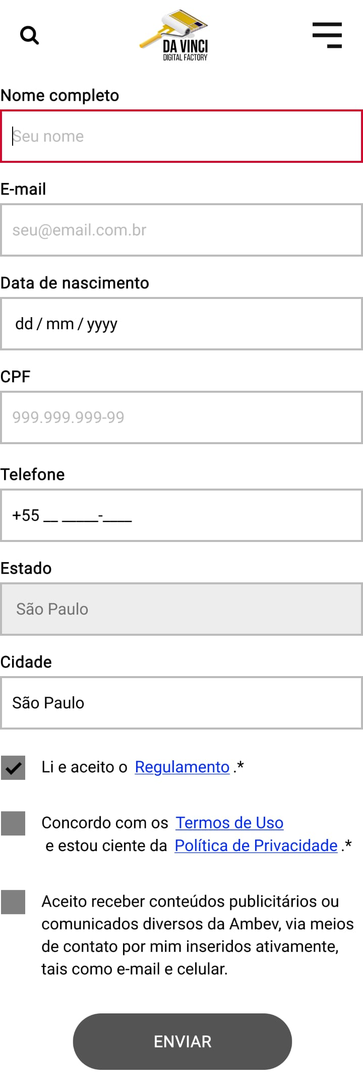
Mobile
Step by Step
Applying the Component:
1. On the page that you want to add a Webform, click “+” on the Layout Canvas.
2. In the list of components, search for the Webform w/options, drag, and drop it to the layout.

2. Click twice on the component to customize:
• Entity: search on the list for the Webform that you created in Content.

• Title: inform a title for your Webform.
• Description: write a brief description of the Webform.

Timer settings:
• Time: If you want you can determine the maximum time for filling the form selecting an option on the list.
• Timer Color/ background color: select a color for the Timer and the background of color.

• Modal Settings: here you can write a message of filling confirmation.

• Modal width: Select a size for the Modal of confirmation.
• Show site name: To show the name of your site on the Modal, select ON.

• Success Icon: this icon will be shown on the Modal of confirmation, if you want it, choose the options to customize.
• Call to action: here you can add a link to redirect the user to other page, after to concluded the form. If you want it, select ON and paste the link and inform a text for the Call to action button.

Form Style:
• Form Action align: select an option for the elements alignment.

• Padding: define the space between the elements inside the form and the border of the form.

• General Colors: select the color options that you want to customize your form.
• Input Colors: these colors will be applied on the fields of filling.
• Checkbox: these colors will be applied on the Checkbox items.

• Button: select the color and position options for the Submit Button.
• Border: choose a color for the Input option. And if you want a Rounded Border, select ON.
• Modal title color: choose a color for the Modal Title.

3. Click on “Apply” to save.
Checkbox border default color is white, but it can be changed.
Styleguide
- • Modal title color
- • Modal timer color
- • Modal timer background color
