- Age Gates
- Footers
- Headers
- Cards Components
- Article Card
- Content Card
- Content Card Advanced
- Card Event
- Entity Card Reference - "News" Bundle Type
- External Product Card
- Full Banner Card
- Info Card
- Image Card
- Image card - Type 2
- Internal Product Card
- Latest News by Type
- Miscellaneous Product List
- New Video Card
- Prizes Cards
- Product Card
- Product List
- Product List by Size
- Simple Content Card
- Text Card
- Text Card [bees.com]
- Text Card - Type 2
- Video Card
- Structure Components
- Container Components
- About Containers
- Accordion Container
- Banner Container
- Bees Hero Full Height
- Container Advanced
- Container with Equal Size Items
- FadeIn Up Animation
- Full Background Animation - bees
- Multiple Accordion Container
- Product Slider Container
- Simple Container Scroll
- Slider Container
- Slider Container Advanced
- Slider Thumbs
- Solid Container
- Stripes Animation Container
- Tabs Container
- Testimonials Slider
- Title and CTA Container
- Two Columns Container
- Content Components
- Accomodation By Tag
- Accordion Item
- Associates Bottle content
- Associates Bottle - Form
- Banner Image
- Banner Image - Type 3
- Banner Image - Type 4
- Banner Event
- Banner Video
- Banner Video With CTA
- Beer Calculator
- Boxed Highlight
- Button
- Button Advanced
- Countdown
- Customer Service
- Events - Upcoming & Past
- Formulário
- Image Gallery
- Image with Lateral Details
- Intern Video
- Jumbotron
- Language Icon - Content
- Latest Contents
- List with custom bullet points
- Manual Content
- Multiple Accordion Item
- Newsletter
- Paragraph
- Paragraph Type 1
- Prizes Boxes
- Responsive Text
- Related Content By Tag
- Simple Newsletter
- Share
- Slider Thumb Item
- Slider Two Columns
- Slider with depoiments
- Swiper
- Testimonial Card List
- Text Slider
- Time Countdown
- Two Column Image And Text (slider thumbs)
- Webform w/ Options
- General Components
- 7 Card Frame
- Newsletter with consent
- Review Comments
- Events List [With Calendar]
- Find a Store
- Find a Store by Area
- Fixed Side Text
- Full Background Image
- Full Height Header
- Google Map Marker
- Modal
- Newsletter with consent
- Places State
- Poll
- Popup
- Responsive Image
- Slider with Timeline
- Svg Item
- Text Animation Highlight
- Trial form
- Webdoor
- Where to Buy
- Layout Components
- Dynamic Components
- Interactive
- Media Components
- SSO Components
- Template Components
Component Menu
- Age Gates
- Footers
- Headers
- Cards Components
- Article Card
- Content Card
- Content Card Advanced
- Card Event
- Entity Card Reference - "News" Bundle Type
- External Product Card
- Full Banner Card
- Info Card
- Image Card
- Image card - Type 2
- Internal Product Card
- Latest News by Type
- Miscellaneous Product List
- New Video Card
- Prizes Cards
- Product Card
- Product List
- Product List by Size
- Simple Content Card
- Text Card
- Text Card [bees.com]
- Text Card - Type 2
- Video Card
- Structure Components
- Container Components
- About Containers
- Accordion Container
- Banner Container
- Bees Hero Full Height
- Container Advanced
- Container with Equal Size Items
- FadeIn Up Animation
- Full Background Animation - bees
- Multiple Accordion Container
- Product Slider Container
- Simple Container Scroll
- Slider Container
- Slider Container Advanced
- Slider Thumbs
- Solid Container
- Stripes Animation Container
- Tabs Container
- Testimonials Slider
- Title and CTA Container
- Two Columns Container
- Content Components
- Accomodation By Tag
- Accordion Item
- Associates Bottle content
- Associates Bottle - Form
- Banner Image
- Banner Image - Type 3
- Banner Image - Type 4
- Banner Event
- Banner Video
- Banner Video With CTA
- Beer Calculator
- Boxed Highlight
- Button
- Button Advanced
- Countdown
- Customer Service
- Events - Upcoming & Past
- Formulário
- Image Gallery
- Image with Lateral Details
- Intern Video
- Jumbotron
- Language Icon - Content
- Latest Contents
- List with custom bullet points
- Manual Content
- Multiple Accordion Item
- Newsletter
- Paragraph
- Paragraph Type 1
- Prizes Boxes
- Responsive Text
- Related Content By Tag
- Simple Newsletter
- Share
- Slider Thumb Item
- Slider Two Columns
- Slider with depoiments
- Swiper
- Testimonial Card List
- Text Slider
- Time Countdown
- Two Column Image And Text (slider thumbs)
- Webform w/ Options
- General Components
- 7 Card Frame
- Newsletter with consent
- Review Comments
- Events List [With Calendar]
- Find a Store
- Find a Store by Area
- Fixed Side Text
- Full Background Image
- Full Height Header
- Google Map Marker
- Modal
- Newsletter with consent
- Places State
- Poll
- Popup
- Responsive Image
- Slider with Timeline
- Svg Item
- Text Animation Highlight
- Trial form
- Webdoor
- Where to Buy
- Layout Components
- Dynamic Components
- Interactive
- Media Components
- SSO Components
- Template Components
Components
Age Gate [Global]
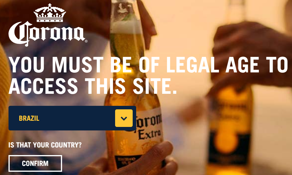
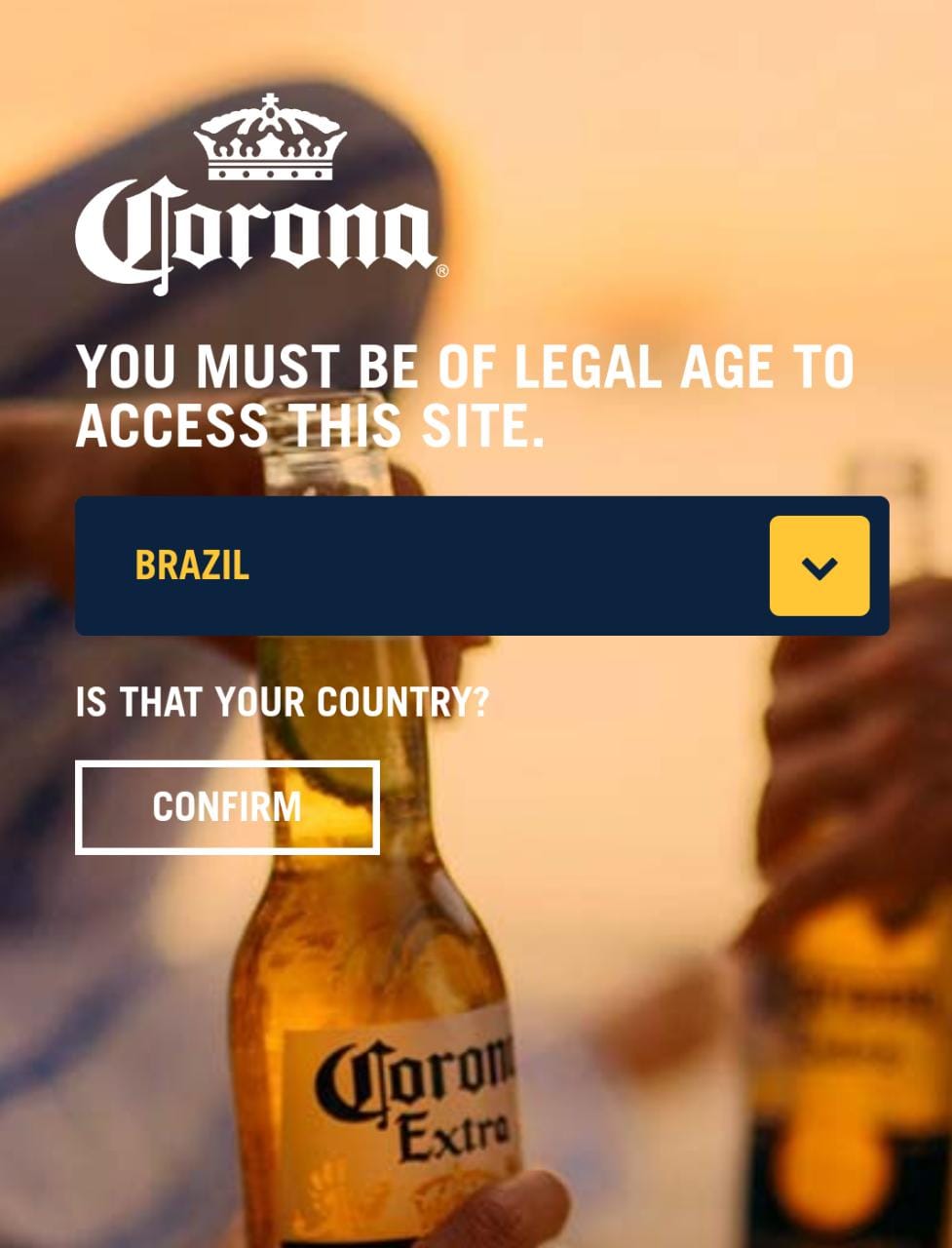
Sites which advertise content inappropriate for users under a specific age must have some kind of restriction. Using an Age Gate can ensure that your content will only be shown to the users which had their age checked.
This Age gate provides the user with an option to select his country, then asks him to confirm that he's above Legal drinking age before redirecting him to the website.
Edited 2 years 3 months ago
Desktop

Mobile

Step by Step
1. Go to Site Studio > Templates > Master Templates, verify which template is signed as default, and select the edit option.
** Note: If you want, you can create a new template by clicking on “Add Master Template”, and then set it as the default template.
2. In the Layout Canvas, click on the “+” button, search for Age Gate [Global] in the Components list, and drag and drop it on the top of the Canvas. The Age Checker needs to be above the other components to work properly.
3. Click on the "Save" button and go to Site Settings to configure the component.
Configuring the Component:
1. Access Content > Site Settings, search for the “Age Gate Global” item and click on the “Create setting” button.
2. Fill the following fields with the requested information:
Configuring Taxonomy:
1. Go to Structure > Taxonomy > Country Rules, select the "List Terms" option and click on the “+ Add Term” button.
2. Fill the fields accordingly:
3. If you want an image to identify the country, just upload and select it on the Image section.
** Note: If your website is Multilanguage, you must put an image here, because this setting will also reflect on the dropdown of the Language Selector.
4. Fill the Country Language(s) settings based on the examples available below each field.
** Note: When the website is Multilanguage, the Language Locale is used to identify the country and redirect the user to the correct website, so filling it incorrectly may lead to incorrect redirects.
5. Click on "Save" when you're done setting the taxonomy to save all changes.
6. To customize this component follow the Styleguide instructions
Age Gates are only available and manageable through Master Templates, so it is not possible to add them to a page as a component. Ask your development team on how to use and properly customize them.
Styleguide
- • Age Gate Texts
- • Age Gate Global Text
- • Age Gate Ask Text
- • Age Gate No Choice Link
- • Age Gate No Choice
- • Age Gate Yes Choice
- • Age Gate Primary Font Color
- • Button Age Gate Custom
- • Base Style
- • Age Gate Logo
- • Primary Color
- • Text Color
- • Background
- • Background Desktop
- • Background Mobile
Age Gate [Global]