- Age Gates
- Footers
- Headers
- Cards Components
- Article Card
- Content Card
- Content Card Advanced
- Card Event
- Entity Card Reference - "News" Bundle Type
- External Product Card
- Full Banner Card
- Info Card
- Image Card
- Image card - Type 2
- Internal Product Card
- Latest News by Type
- Miscellaneous Product List
- New Video Card
- Prizes Cards
- Product Card
- Product List
- Product List by Size
- Simple Content Card
- Text Card
- Text Card [bees.com]
- Text Card - Type 2
- Video Card
- Structure Components
- Container Components
- About Containers
- Accordion Container
- Banner Container
- Bees Hero Full Height
- Container Advanced
- Container with Equal Size Items
- FadeIn Up Animation
- Full Background Animation - bees
- Multiple Accordion Container
- Product Slider Container
- Simple Container Scroll
- Slider Container
- Slider Container Advanced
- Slider Thumbs
- Solid Container
- Stripes Animation Container
- Tabs Container
- Testimonials Slider
- Title and CTA Container
- Two Columns Container
- Content Components
- Accomodation By Tag
- Accordion Item
- Associates Bottle content
- Associates Bottle - Form
- Banner Image
- Banner Image - Type 3
- Banner Image - Type 4
- Banner Event
- Banner Video
- Banner Video With CTA
- Beer Calculator
- Boxed Highlight
- Button
- Button Advanced
- Countdown
- Customer Service
- Events - Upcoming & Past
- Formulário
- Image Gallery
- Image with Lateral Details
- Intern Video
- Jumbotron
- Language Icon - Content
- Latest Contents
- List with custom bullet points
- Manual Content
- Multiple Accordion Item
- Newsletter
- Paragraph
- Paragraph Type 1
- Prizes Boxes
- Responsive Text
- Related Content By Tag
- Simple Newsletter
- Share
- Slider Thumb Item
- Slider Two Columns
- Slider with depoiments
- Swiper
- Testimonial Card List
- Text Slider
- Time Countdown
- Two Column Image And Text (slider thumbs)
- Webform w/ Options
- General Components
- 7 Card Frame
- Newsletter with consent
- Review Comments
- Events List [With Calendar]
- Find a Store
- Find a Store by Area
- Fixed Side Text
- Full Background Image
- Full Height Header
- Google Map Marker
- Modal
- Newsletter with consent
- Places State
- Poll
- Popup
- Responsive Image
- Slider with Timeline
- Svg Item
- Text Animation Highlight
- Trial form
- Webdoor
- Where to Buy
- Layout Components
- Dynamic Components
- Interactive
- Media Components
- SSO Components
- Template Components
Component Menu
- Age Gates
- Footers
- Headers
- Cards Components
- Article Card
- Content Card
- Content Card Advanced
- Card Event
- Entity Card Reference - "News" Bundle Type
- External Product Card
- Full Banner Card
- Info Card
- Image Card
- Image card - Type 2
- Internal Product Card
- Latest News by Type
- Miscellaneous Product List
- New Video Card
- Prizes Cards
- Product Card
- Product List
- Product List by Size
- Simple Content Card
- Text Card
- Text Card [bees.com]
- Text Card - Type 2
- Video Card
- Structure Components
- Container Components
- About Containers
- Accordion Container
- Banner Container
- Bees Hero Full Height
- Container Advanced
- Container with Equal Size Items
- FadeIn Up Animation
- Full Background Animation - bees
- Multiple Accordion Container
- Product Slider Container
- Simple Container Scroll
- Slider Container
- Slider Container Advanced
- Slider Thumbs
- Solid Container
- Stripes Animation Container
- Tabs Container
- Testimonials Slider
- Title and CTA Container
- Two Columns Container
- Content Components
- Accomodation By Tag
- Accordion Item
- Associates Bottle content
- Associates Bottle - Form
- Banner Image
- Banner Image - Type 3
- Banner Image - Type 4
- Banner Event
- Banner Video
- Banner Video With CTA
- Beer Calculator
- Boxed Highlight
- Button
- Button Advanced
- Countdown
- Customer Service
- Events - Upcoming & Past
- Formulário
- Image Gallery
- Image with Lateral Details
- Intern Video
- Jumbotron
- Language Icon - Content
- Latest Contents
- List with custom bullet points
- Manual Content
- Multiple Accordion Item
- Newsletter
- Paragraph
- Paragraph Type 1
- Prizes Boxes
- Responsive Text
- Related Content By Tag
- Simple Newsletter
- Share
- Slider Thumb Item
- Slider Two Columns
- Slider with depoiments
- Swiper
- Testimonial Card List
- Text Slider
- Time Countdown
- Two Column Image And Text (slider thumbs)
- Webform w/ Options
- General Components
- 7 Card Frame
- Newsletter with consent
- Review Comments
- Events List [With Calendar]
- Find a Store
- Find a Store by Area
- Fixed Side Text
- Full Background Image
- Full Height Header
- Google Map Marker
- Modal
- Newsletter with consent
- Places State
- Poll
- Popup
- Responsive Image
- Slider with Timeline
- Svg Item
- Text Animation Highlight
- Trial form
- Webdoor
- Where to Buy
- Layout Components
- Dynamic Components
- Interactive
- Media Components
- SSO Components
- Template Components
Components
SVG Item
This component allows you to render SVG Markup.
Edited 2 years 9 months ago
Desktop

Mobile

Step by step:
1. First, you need to add an SVG Item. To do that, go to the page that you want to add this component, and click the “+” on the Layout Canvas;
2. Search in the list for the Svg Item and add it by dragging the component into the Layout Canvas;
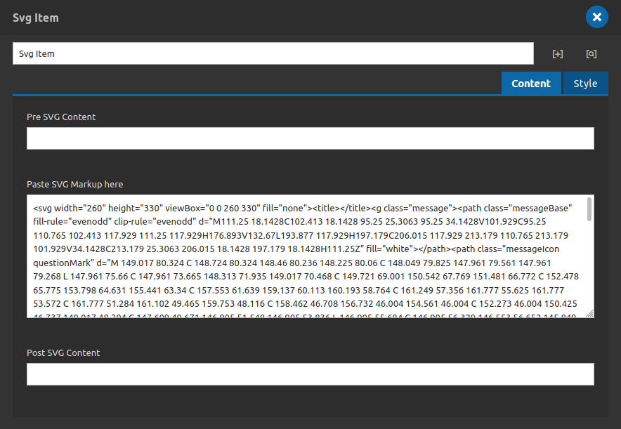
3. Double click at Svg Item to configure it:

Inside the Content Tab you have the options fields above. You can add a pre and post svg markup contents (optional) to complement your svg markup if you wanted.
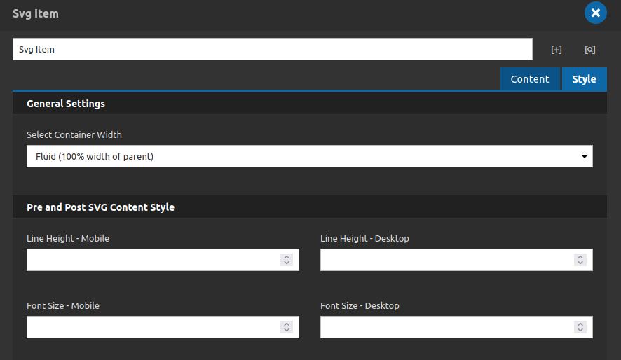
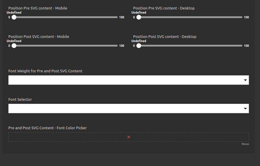
Inside the Style tab you can style your svg item even as the post and pre fields if you need it. Take a look on the options:


You have options for the pre and post elements of this component.

