

Components
Slider with Timeline
This component allows you to add a interactive slider with a timeline feature.
To work properly this feature is composed by 3 components:
- Slider with Timeline
- Slider with Timeline - Years
- Slider with Timeline - Month
Edited 3 years ago
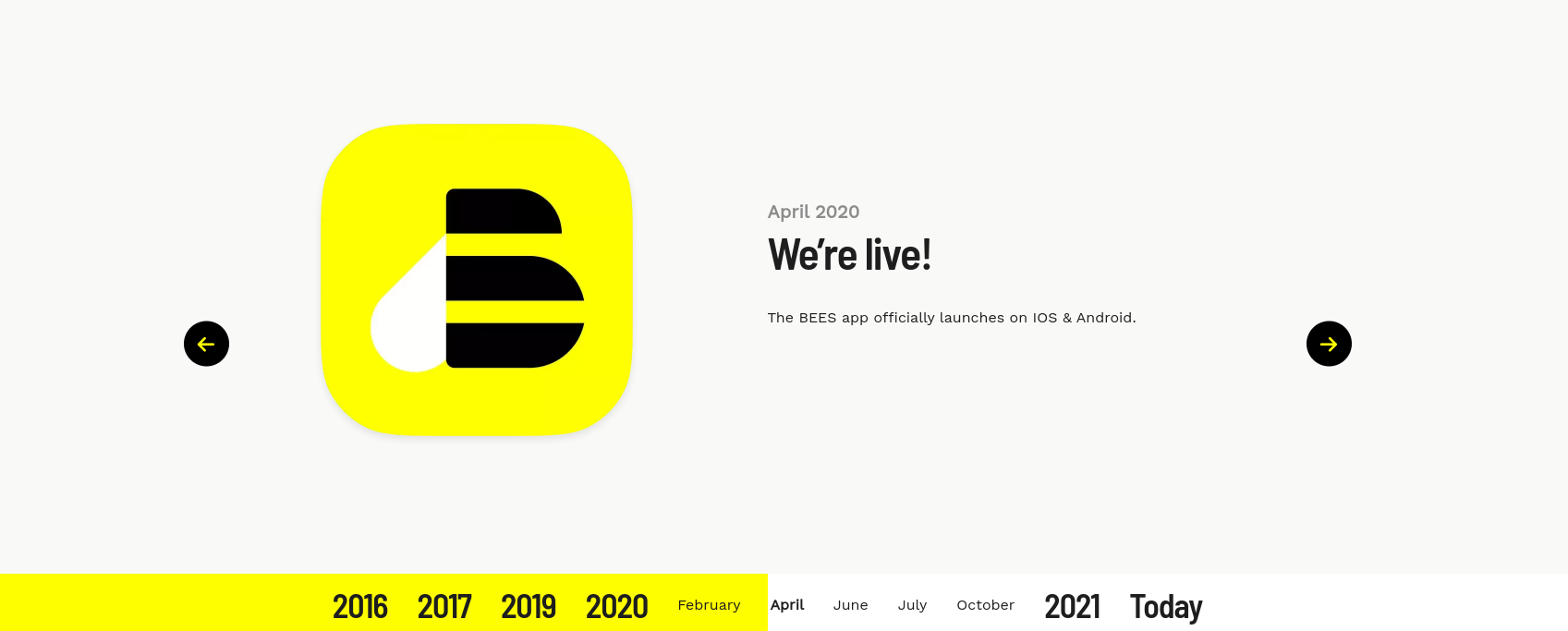
Desktop
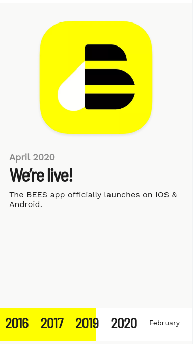
Mobile
Step by step:
As we mentioned this functionality is built by 3 components, so lets add one at time and understand the possibilities here.
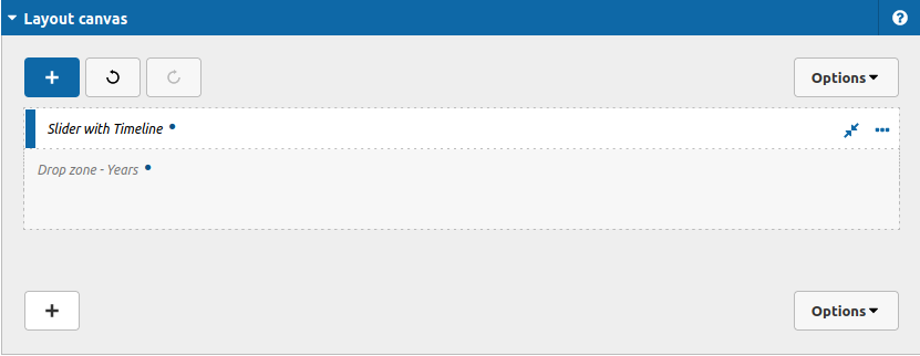
1. Lets start by the Slider with Timeline. To add this component, go to the page that you want to add this component, and click the “+” on the Layout Canvas;
2. Search in the list for the Slider with Timeline and add it by dragging the component into the Layout Canvas;
3. This is the first component that we need to fill, inside of it we are going to add the settings of the container slider with timeline itself (colors) and register the content for each month that we want to represents, lets have a look:
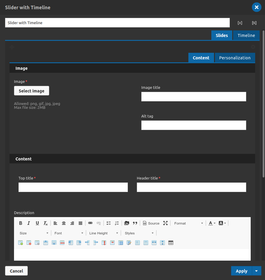
So this is the appearance, let's start by the timeline tab:
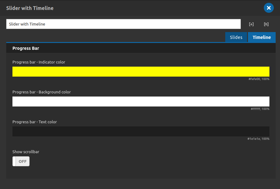
Timeline Tab
Main settings for the time line functionality itself.
Progress bar:
- • Progress Bar - indicator color: Choose which color will be use on the progress bar.
- • Progress Bar - Background Color: Choose which color will be use on the background of the progress bar.
- • Progress Bar - Text Color: Choose which color will be use on the text inside the progress bar.
• Show scrollbar: Choose the behavior of the slider with timeline container. If turned on your progress bar could overflow the container and you can scroll horizontally to check the elements.
Now lets go back to the...
Slides Tab
This is the place where we are going to add the main content of this component and for each slide. Lets take a look again in the options:
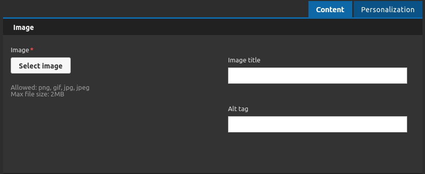
Content Tab
Image:
- • Image uploader: Choose an image for your slide item.
- • Image Title: Set the image title.
- • Image Alt: Set the image alternative text.
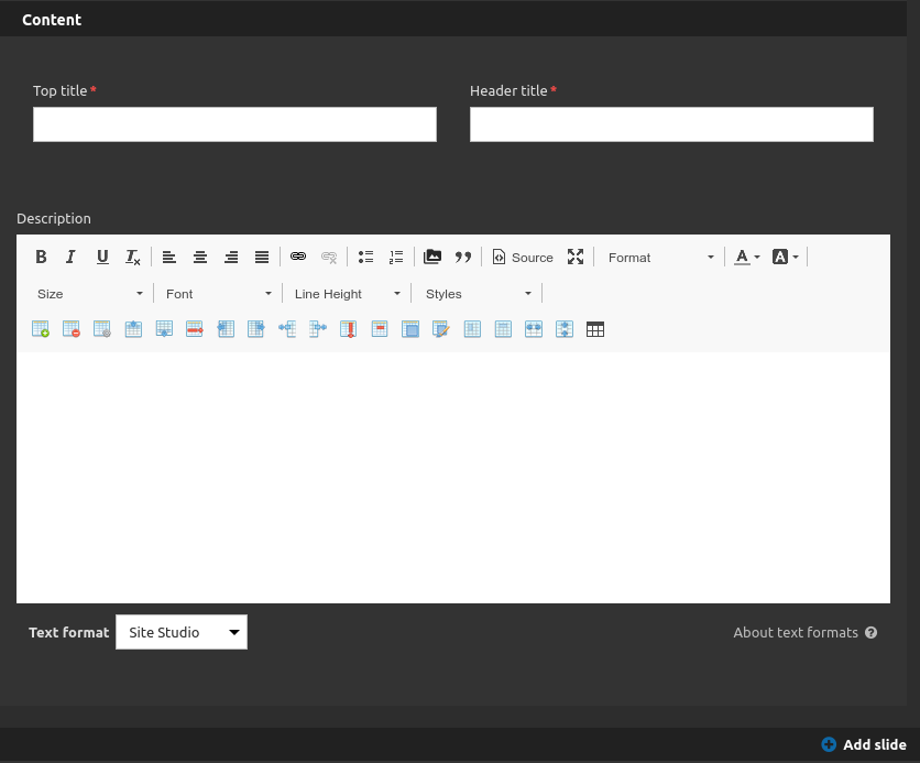
Content:
- • Top Title: Set the top title of your slider item.
- • Header Title: Set the header title of your slider item.
- • Description: You can type any information that you want for to be related with your titles and image here.
- • Add Slide: This component use the repeater fields logic, so if you wan to add a new slide item, click on this button.
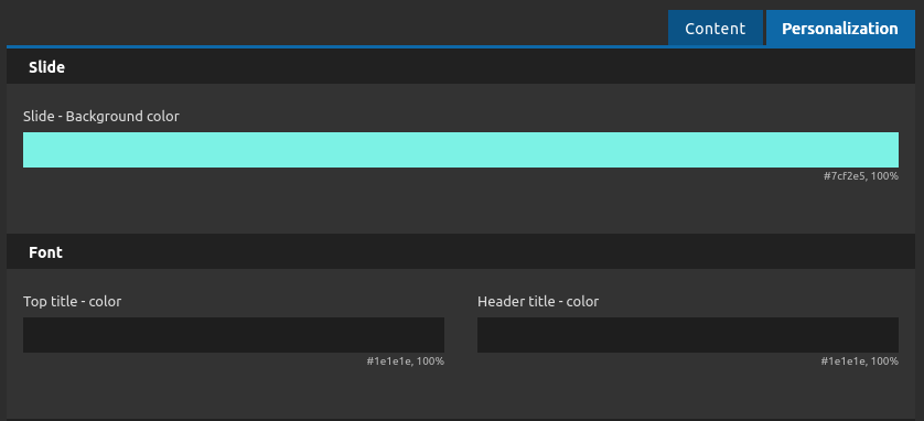
Personalization Tab
Here you can set the style of your slide item
Slide:
- • Slide - Background Color: Select a color for your background slide content.
Font:
- • Top Title - Color: Choose a color for the top title.
- • Header Title - Color: Choose a color for the header title.
-
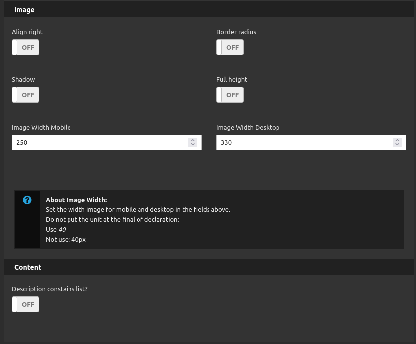
Image:
- • Align Right: Turn on to align the image on the right position.
- • Shadow: Turn on to apply a shadow box to the image with 30px of blur and color rgba(0,0,0,.2).
- • Border radius: Turn on to apply a border radius for the image with the value of 35px.
- • Full height: Makes your image 100% height.
• Image Width Mobile: Set the image width for mobile devices (do not use units).
• Image Width Desktop: Set the image width for desktop devices (do not use units).
Content:
- • Description Contains list?: Turn on when you use ordered or unordered list inside your wysiwyg to break it properly in two columns.
See an example:

Note 1:
There is a important information about the slides items here.
The number of slides added to this components should be the same of all months inside of a Slider with Timeline. This means the feature anchor each slide item that you register by the order of the months that you put inside the component. This is a automatic behavior.
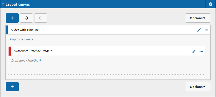
4. Now we have the main content to our component, but only with that it is not work correctly, so now we need to set all the Years that we want to represent inside our timeline. For that, click on the "+" button of the Layout Canvas.
5. Search in the list for the Slider with Timeline - Year and add it by dragging the component into your Slider with Timeline Component:
6. This is the second component that we need, lets take a look inside its interface:
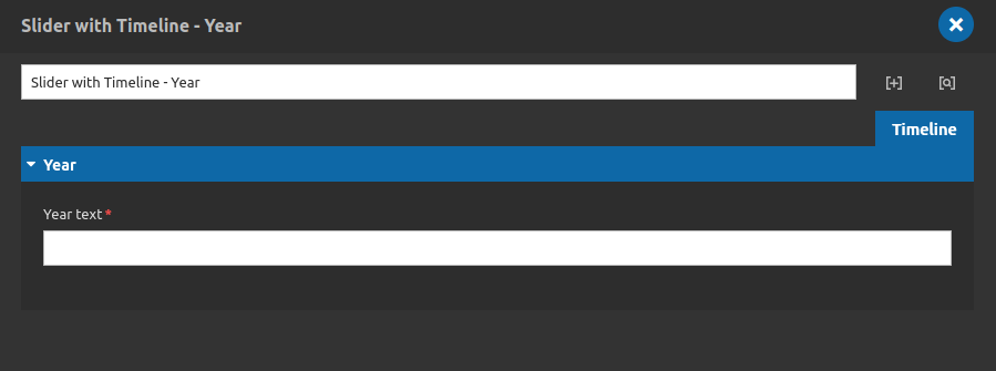
Inside of it, you just have the option to fill the Year Text.
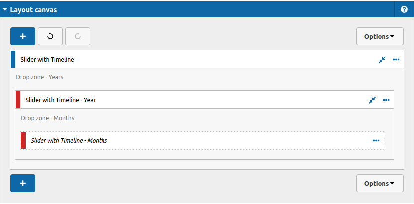
7. To finish the register now we need to set all months or highlights texts for this year. To do that, click again on the "+" button of the Layout Canvas.
8. Search in the list for the Slider with Timeline - Months and add it by dragging the component into your Slider with Timeline - Year Component:
9. This is the last component that we need, lets take a look inside its interface:
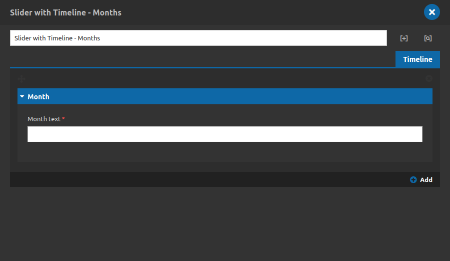
Month:
- • Month text: Type your month or highlight text here.
- • Add: Use this option to add new months to your year, you don't need to add new components inside the year timeline component to add new months! You can do that here.
Note 2:
Add how many years and months you need just keep in mind that the total numbers of months should be the same of the numbers of slide items inside the first structure showed here. If you forget any content the component probably is going to break up or going to have unexpected behavior.
Note 3:
The magic of this component is its possibility to navigate among the items by the arrows or by the years/months texts, keep that in mind to prepare a nicely experiences for your website. And the progress bar filling during the navigation.
Note 4:
about the years/months texts behaviors: the first month will share the same link of the current year in the timeline list, so if you click in one or another it doesn't matter.
