

Components
Tabs Container
With this component you can wrapper different contents by tabs and with that have a nice view of your content.
This component have two views, one for mobile (which is an accordion behavior), and a desktop version (which is the tabs navigation behavior), these behavior cannot be changed or inverted.
Edited 3 years ago
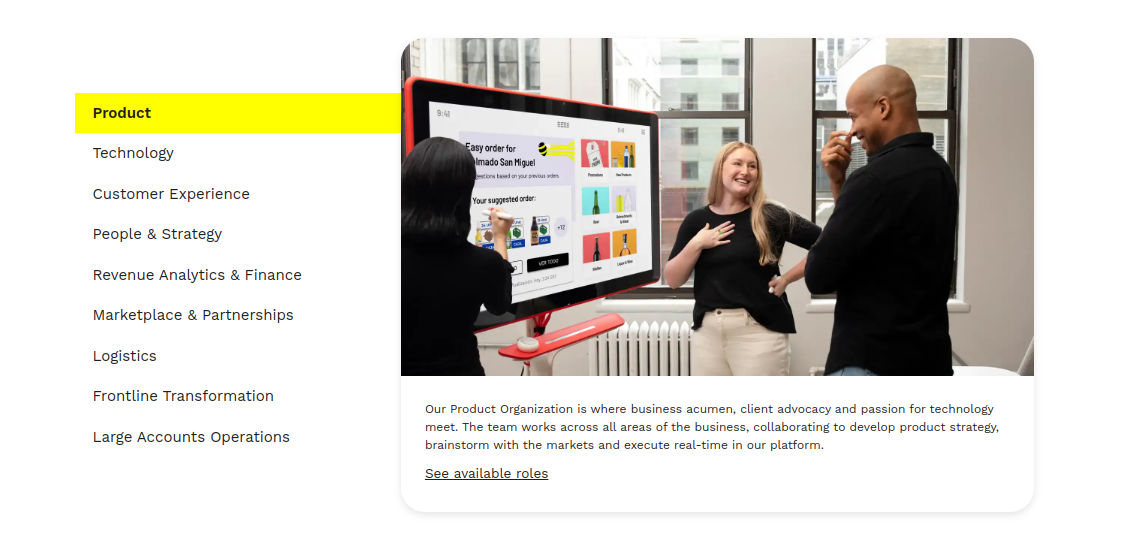
Desktop
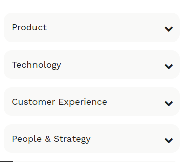
Mobile
Step by step:
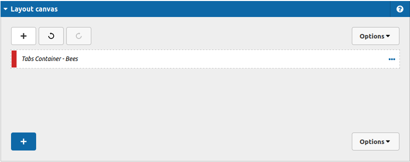
1. First, you need to add an Tabs Container. To do that, go to the page that you want to add this component, and click the “+” on the Layout Canvas;
2. Search in the list for the Tabs Container and add it by dragging the component into the Layout Canvas;
3. After that you can take a look on the options:
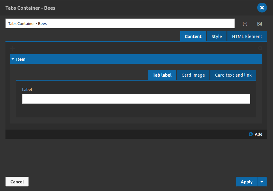
For each tab item that you want to show, you can set a tab label, an image for the content, a text and link.
Content Tab
Item tab - Tab Label:
- • Label: Type the label of the tab item/accordion item, it is a identifier of your tab/accordion.
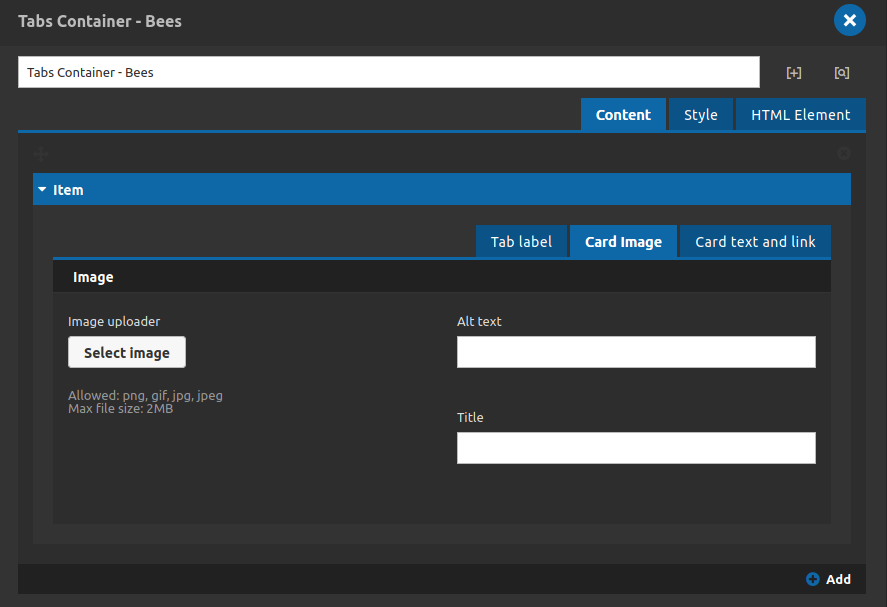
Item tab - Tab Card Image:
- • Image Uploader: Upload the image for your tab item.
- • Alt Text: Type an alternative text for your image.
- • Title: Set the image's title.
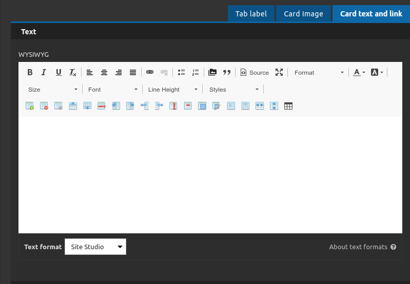

Item tab - Tab Card Text and Image - Text:
- • Wysiwyg: Type your text content here.
- Item tab - Tab Card Text and Image - Link:
- • Link label: Set a link identifier here.
- • Link url: Set the url link here.
- • Link target: Set the link target here (to open in a new tab or not).
Item tab:
- • Link url: Set the url link here.
4. After the tab items content register you can set the style for your whole component at the style tab.
Style Tab
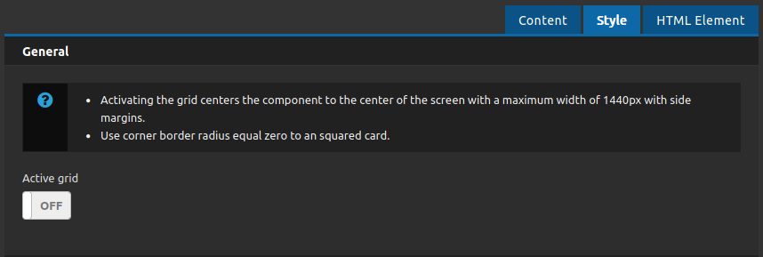
Style tab - General:
• Active Grid: Turn on this toggle to center the component at the middle of the screen.
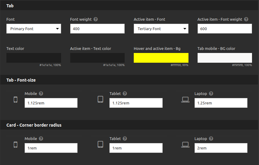
Style tab - Tab:
You can set all the style for your tab (tab label and tab item) here
Style tab - Tab - Font - Size:
Set the font size for each breakpoint here.
Style tab - Card - Corner border radius:
Set the border radius for each breakpoint here.
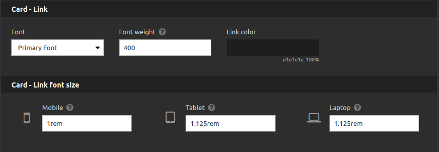
Style tab - Card Link:
Set the font style for each breakpoint here.
Style tab - Link font size:
Set the font size for each breakpoint here.
5. Also you have the HTML element tab, where you can set a class to do a special style customization if you need and set a id for anchor your tabs container component for a internal link.
6. If you have done all the settings that you need you can click on "apply" button and see the results on the page.
