

Components
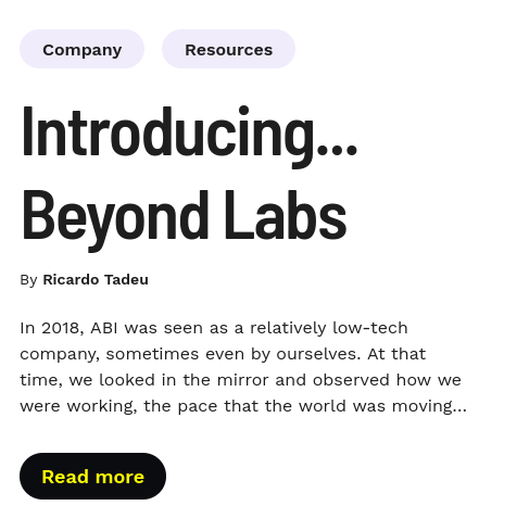
Article Card
With this component you can add region with links on header, text, title, subtitle and one more button on the bottom with the option to invert the header with the footer/bottom position.
Edited 3 years ago
Desktop
Mobile
Step by step:
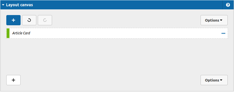
1. First, you need to add an Article Card. To do that, go to the page that you want to add this component, and click the “+” on the Layout Canvas;
2. Search in the list for the Article Card and add it by dragging the component into the Layout Canvas;
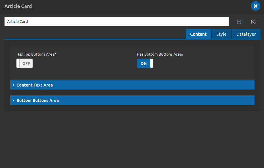
3. After that you can take a look on the options:
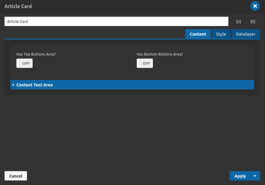
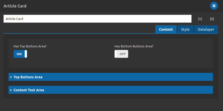
Content Tab
- • Has Top Buttons Area?: Turn on to show the Top Buttons Area. And to enable at least one button at the component's header.
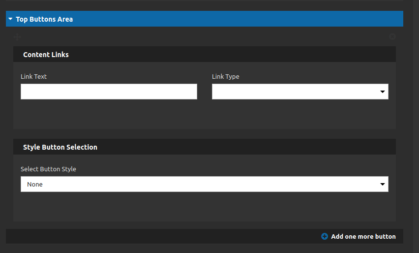
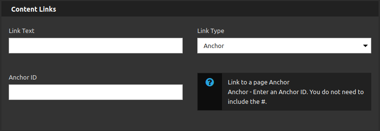
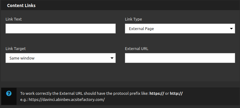
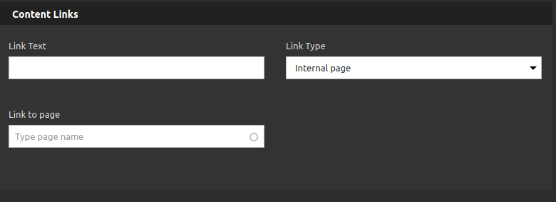
Content links:
- • Link text: Type your link label.
- • Link type: Select the link type (internal link to refer Internal Page, External URL to set external links or anchor to anchor some sections on the page).
Style Button Selection:
- • Select Button Style: Attach a custom style of links category to your header links/buttons.
- • Add one more button: Use this button to add a new link to your component. You can add until 4 buttons.
- • Has Bottom Buttons Area?: Turn on to show the Bottom Buttons Area. And to enable the button at the component's footer/bottom.
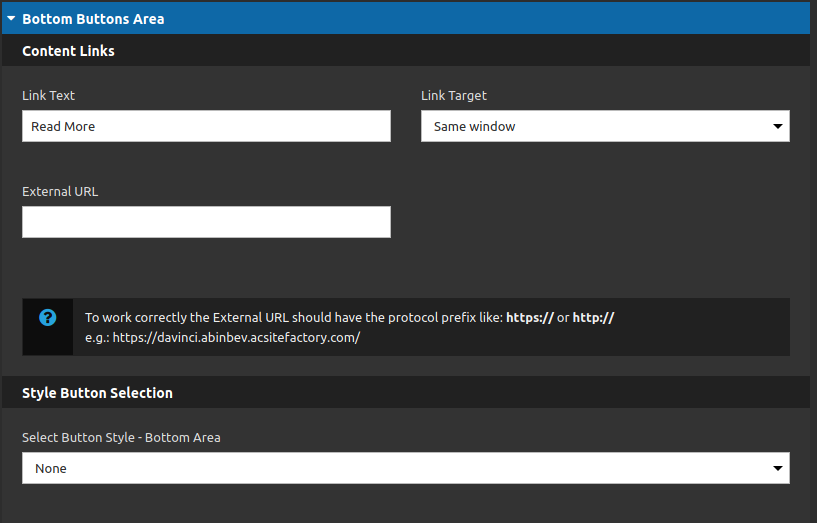
You have the same options of the headers content area, The only difference is that impossible to add more than one link. Because of that we have the option to invert the header with the bottom/footer.
4. Also you have the Context Text Area:
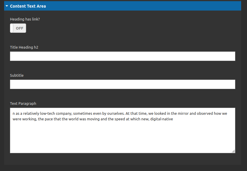
- • Text Paragraph: Type your text here.
- • Subtitle: Add your subtitle here.
- • Title Heading h2: Add your title here.
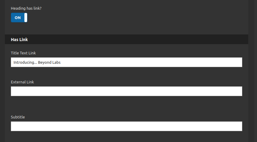
- • Heading has link?: If turned on you can apply a link as a wrapper for the whole title.
5. Lets keep going to the Style Tab:
Settings Tab
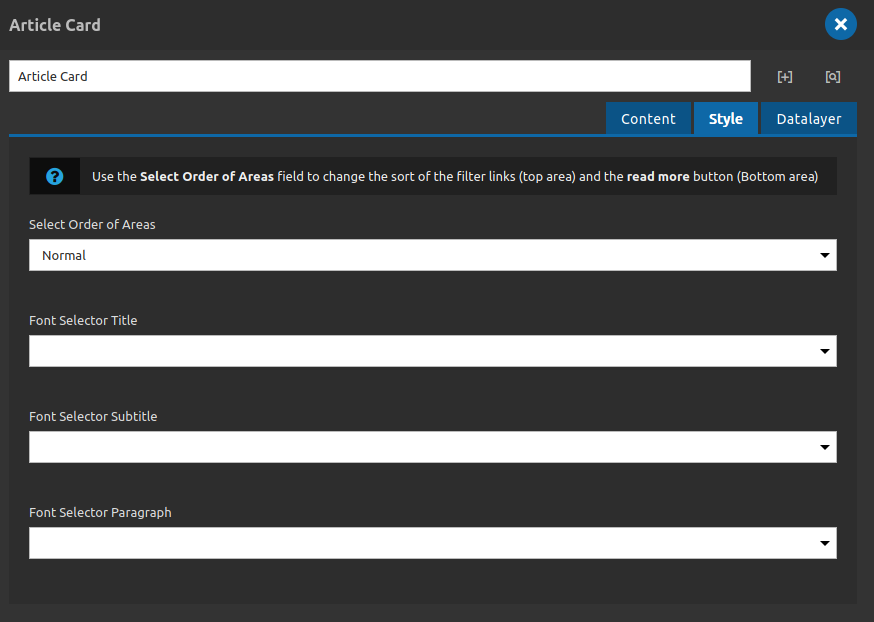
- • Select order of areas: You can choose between 2 options: normal and reverse (reverse will invert the footer/bottom with the header area.
- • Font Selector Title: You can choose one of the five options of fonts on Da Vinci (primary, secondary, tertiary, quaternary and quintenary), for the title.
- • Font Selector Subtitle: You can choose one of the five options of fonts on Da Vinci (primary, secondary, tertiary, quaternary and quintenary), for the subtitle.
- • Font Selector Paragraph: You can choose one of the five options of fonts on Da Vinci (primary, secondary, tertiary, quaternary and quintenary), for the text.
After all these steps you can register your data layer at the tab with this name.
6. Click on "apply" and check your component.
By Ricardo Tadeu
In 2018, ABI was seen as a relatively low-tech company, sometimes even by ourselves. At that time, we looked in the mirror and observed how we were working, the pace that the world was moving and the speed at which new, digital-native
